Felicitas Kofler
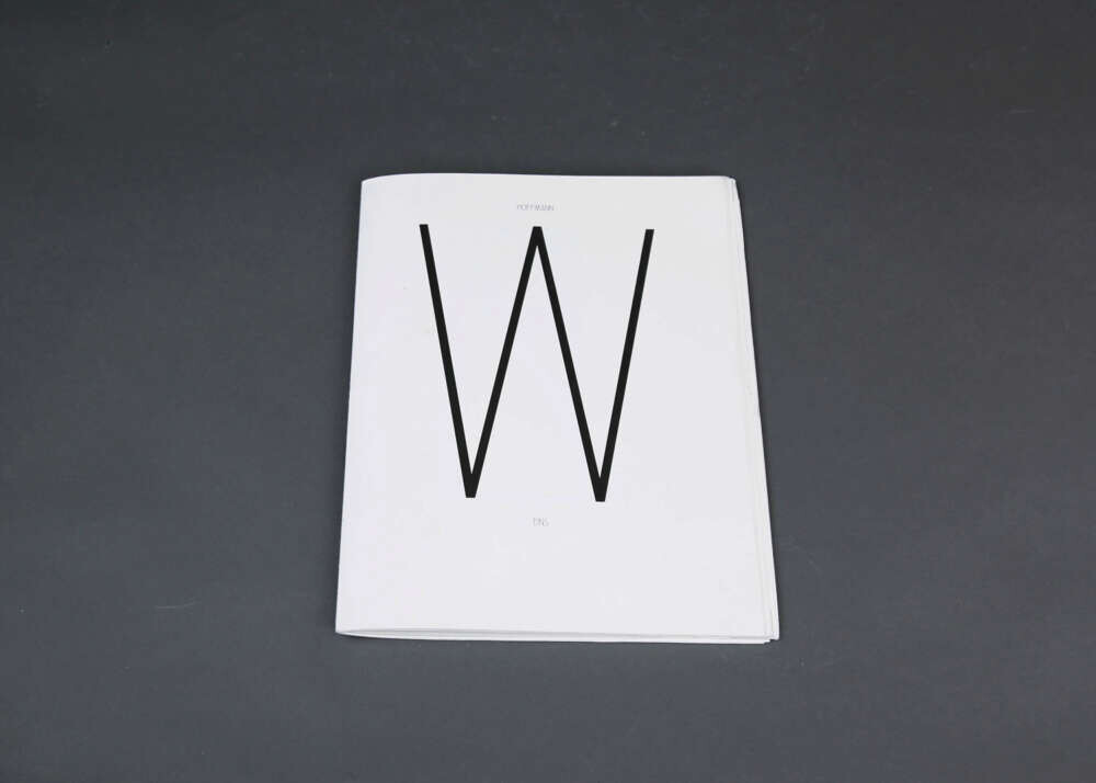
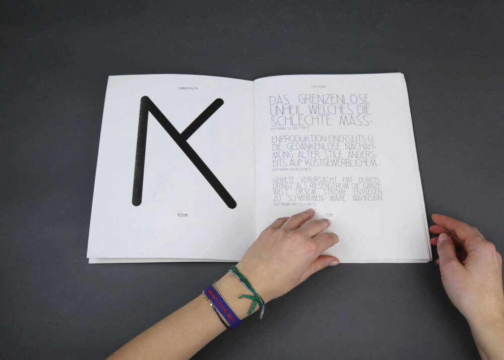
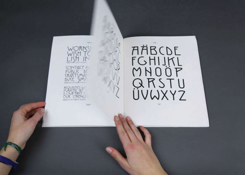
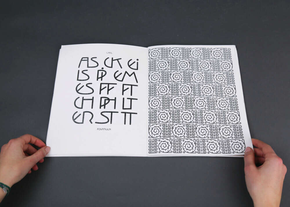
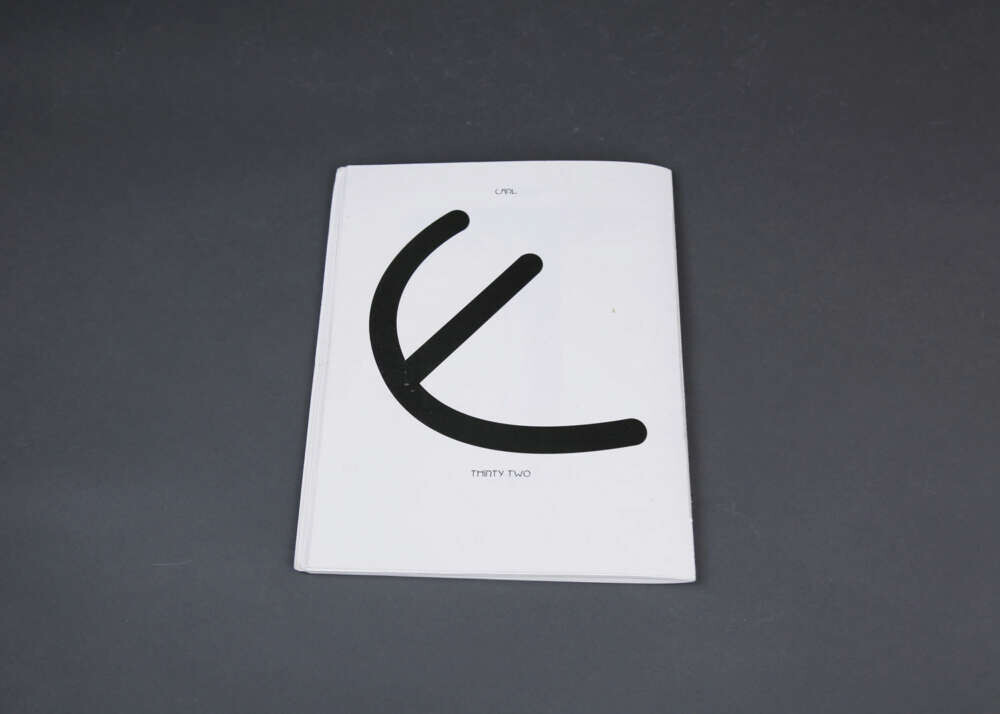
My thesis is based on the concept of structure and chaos, and the interplay of hiding and finding as a means of revealing and communicating messages. For my final project I researched the Wiener Secession and Wiener Werkstätte movements. Being from Vienna, I was curious to see how graphic design had been used in the past; how Viennese designers communicated with their public. Amidst the archival chaos, I discovered a large collection of typefaces hidden in publications, postcards and posters. I started tracing some of the typefaces, and ended up creating five mono-lined fonts, each consisting of a family of three weights, as well as two patterns, which I ultimately reprinted in a specimen book. Each typeface collection is reduced down to uppercase A-Z, a period and a hyphen. I created a graphic tool box of found objects, revealing hidden and forgotten typography and made it available for everyone to use today. Lithography was one of the main printing methods back in the 1900s in Vienna. I revisited this method in its modernized form (photo-lithography) to create my specimen book. Rather than creating a conventional specimen book, I played with the structure/content and the title is hidden. The book is bilingual, written in both English and German and features the manifesto of the Wiener Werkstätte (Arbeitsprogramm). Structure is given to it through the use of the golden ratio and the placement of the different typefaces is based around title Werkstätte (Workshop), which ties the book together.