Taryn Dooley
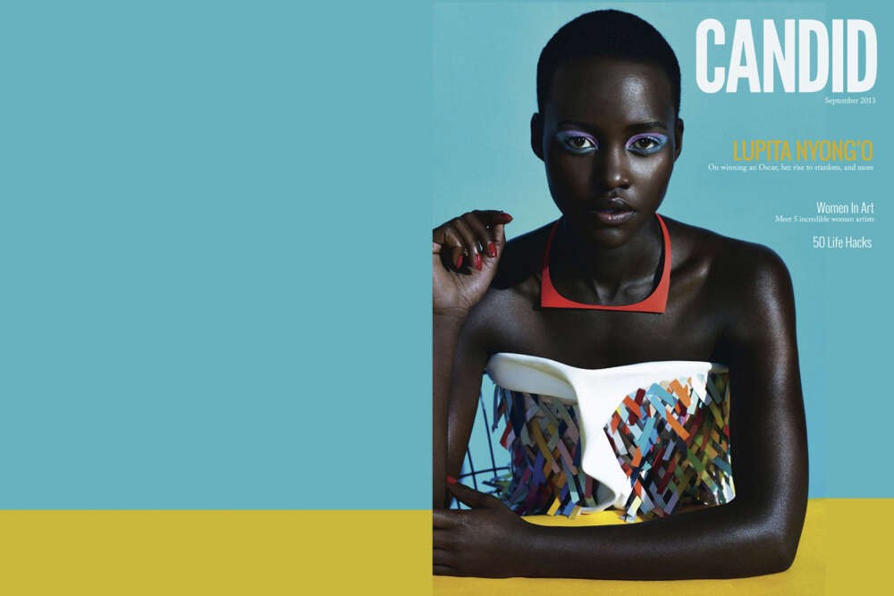
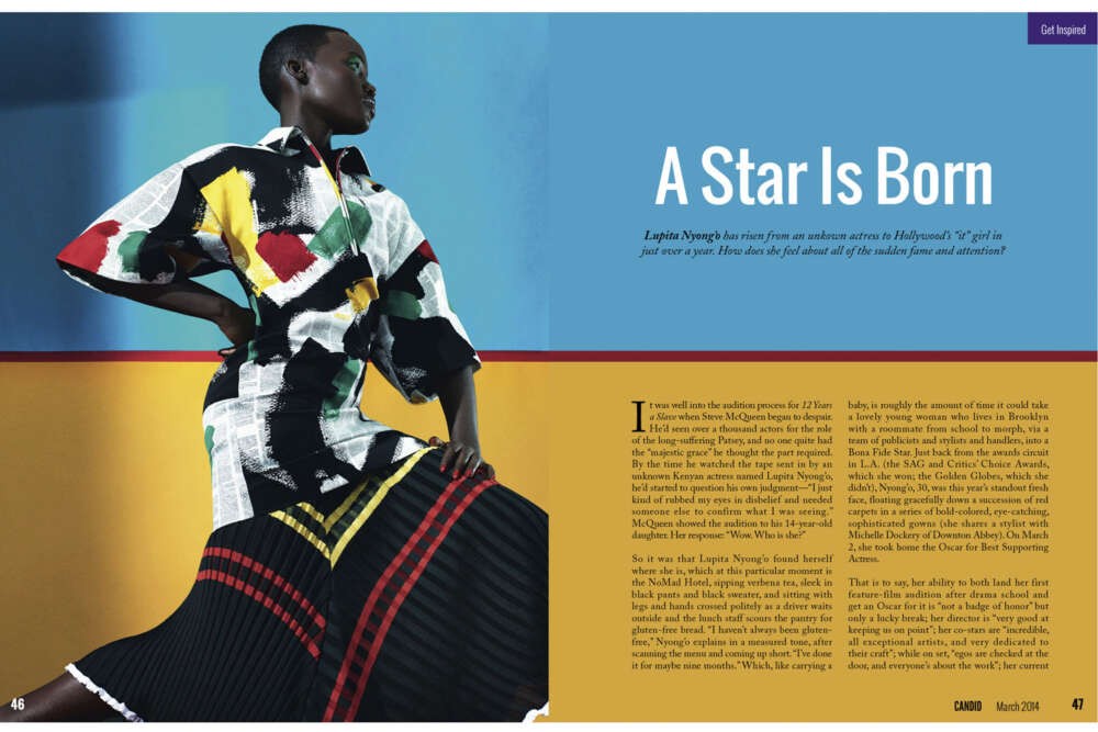
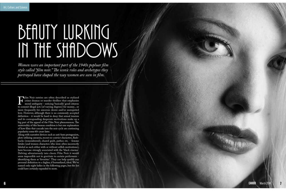
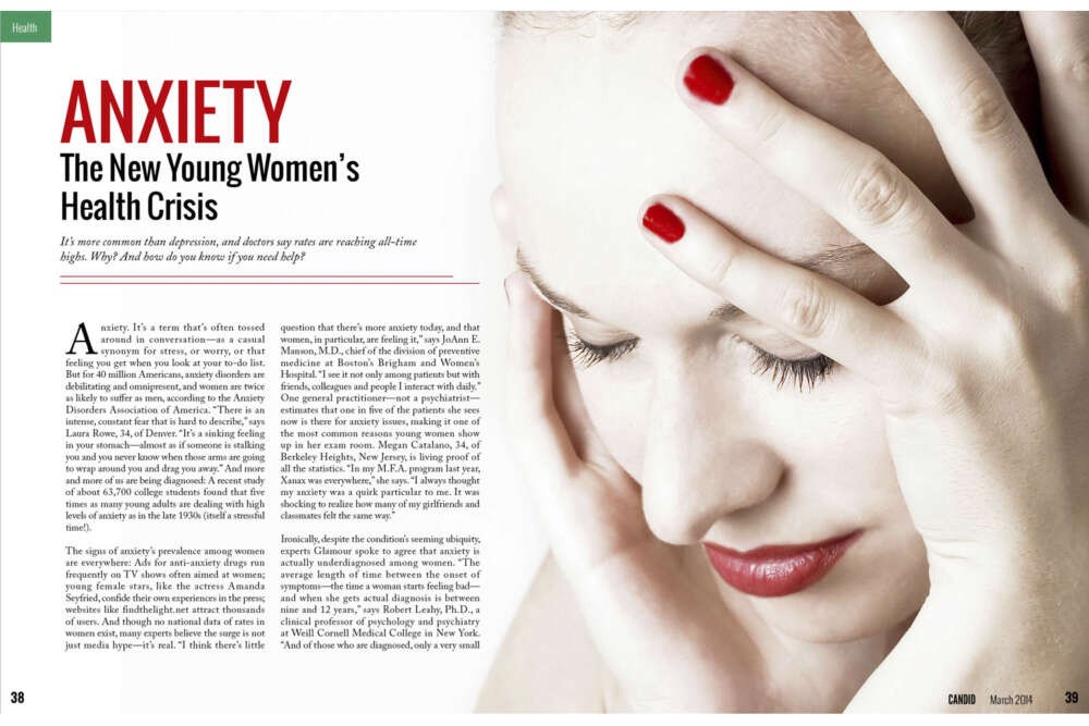
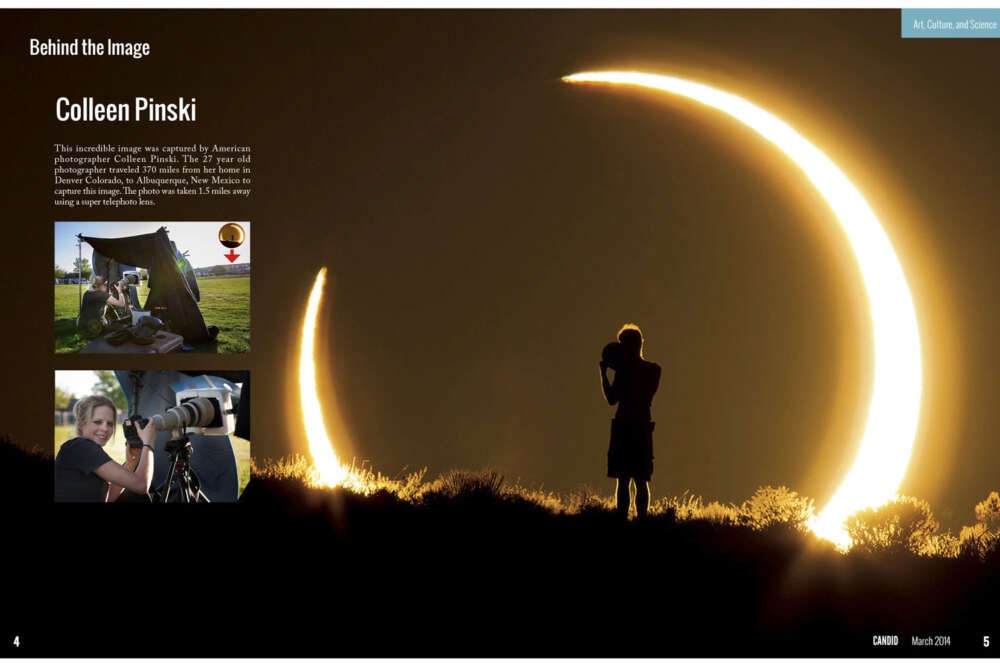
My thesis project is a women’s magazine that is meant to be the visual and editorial antithesis of current women’s magazines such as Cosmopolitan, Glamour, Allure, and Vogue. It has a straightforward approach and focuses on the images by using full bleed photographs and artwork. I used a mix of my own photography and found images. The design of the magazine is very clean and minimal to contrast current women’s magazines, which are often busy and cluttered. Color plays a strong role in “Candid” by establishing a different color for each section of the magazine, and by acting as a navigational tool. Design is used throughout the publication to emphasize the differences between Candid and other women’s magazines. I chose to create this magazine to address the unattainable standard of beauty that is set by the images and advertisements in traditional publications and by the media as a whole. This portrayal of “perfect” women as the standard to achieve has severe consequences for women, including depression, low self esteem, and eating disorders. I chose to focus on magazines because they are the most easily and commonly altered. My magazine will not allow the manipulation of images to alter a woman’s appearance. The articles will encourage self confidence, health, and empowerment instead of focusing on what women “should” be. I chose the name Candid because it means to be straightforward and truthful, which is what the images in my magazine will be. They will show the beauty that women already posses instead of determining what is beautiful and what is not. Candid is for women who want to read educational and enriching content and see images of women who look like them, instead of the unattainable “perfection” portrayed by the media.