Julie Hanna Chea
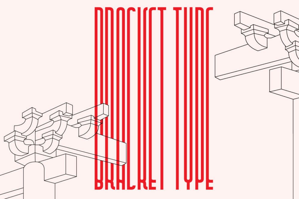
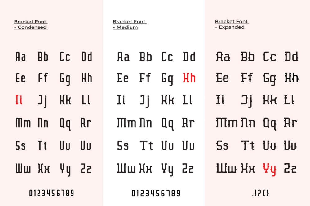
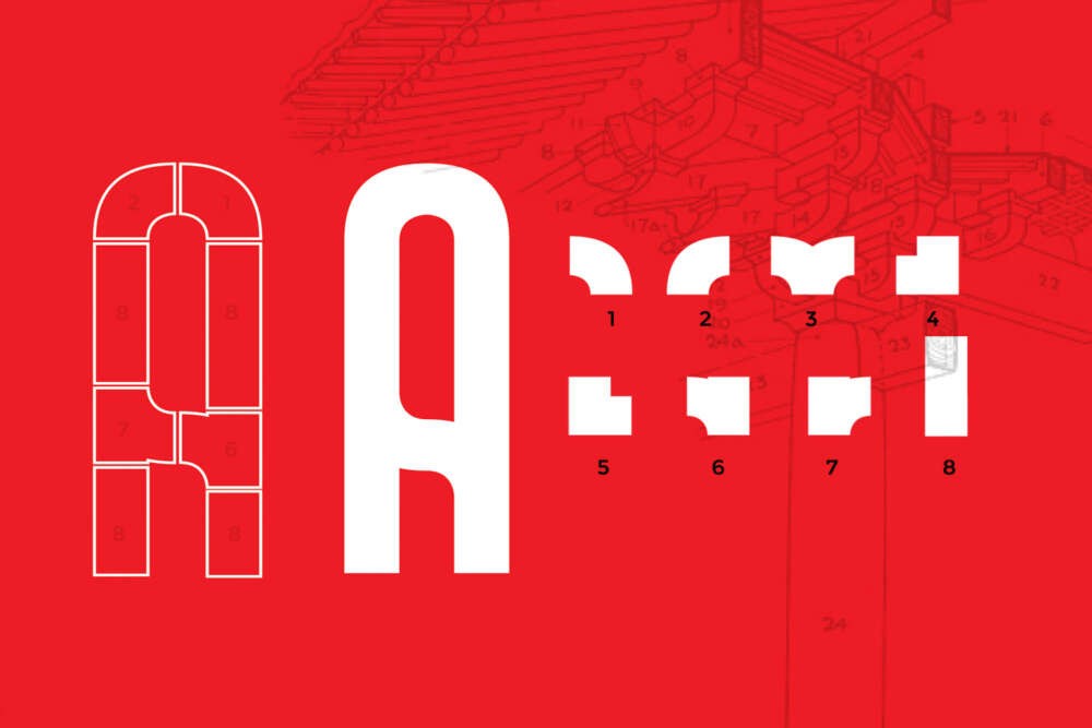
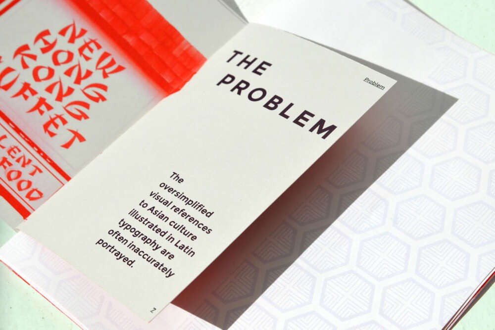
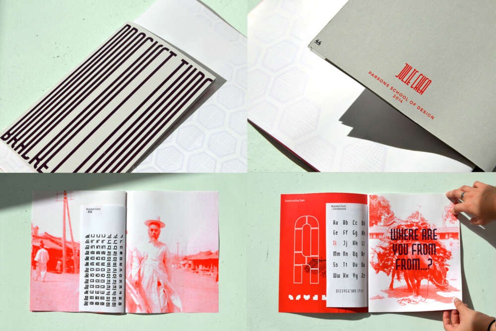
Typography excites me because of its diversity and its ability to take on various personalities, reminiscent of the works of Cindy Sherman. As a designer, I began to notice how typography itself branded objects and events, as well as individuals. But you don’t need to be a designer to notice coherent and incoherent design. One of the design tropes that stood out to me are the typography used to represent Asian restaurants. Chunky chopstick, bamboo, and brush stroke typography are used to represent Asia and have definitely left an impression. The problem is how the visual references of Asia are oversimplified in Latin typography. Therefore, to improve our cultural understandings of Asia , beyond the overused elements, I wanted to design a type face that will progress by focusing one culture’s architecture in order to obtain deep cultural references. The modular typeface, Bracket Font, is inspired by 12th century royal palaces in Korea. Specifically inspired by the architectonic elements, such as the Dougong system, which is Northern Asia’s most unique and acclaimed interlocking bracket system. By focusing on the ratio, style, and construction of ornamentation, I was able to bring out deeper Korean cultural references and maintain a western identity by balancing both cultures equally in the design. Additionally, for the bracket typeface to be more than just another Latin alphabet that embodied in Asian facade, I made the font bilingual, so the typeface could live together in two cultures harmonious