Dissecting the Dot
Nadine Muhtadi
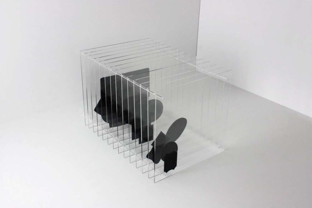
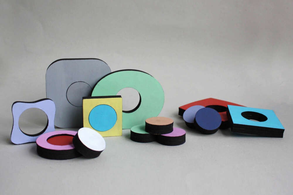
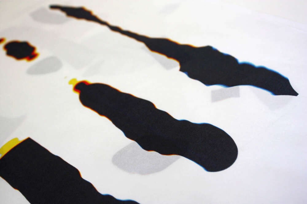
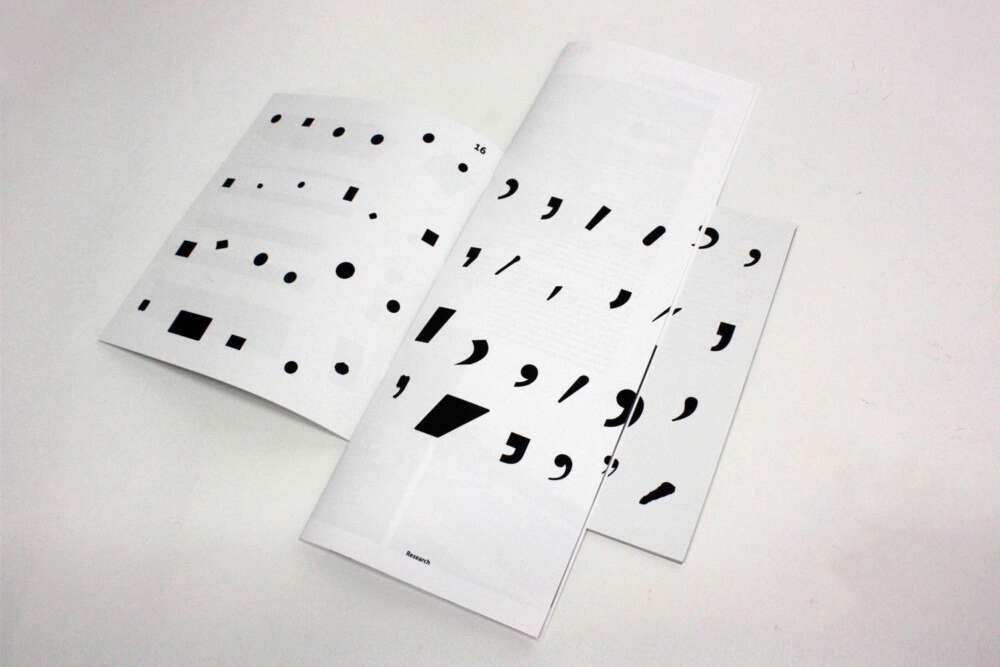
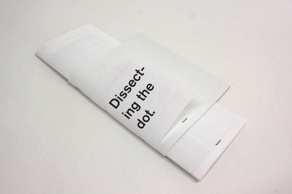
Communication is something we learn at an early age. It is a tool used to understand one another. It is ingrained in our system that as we grow past preschool, we no longer make an effort to understand the components needed to communicate. This project is about taking something that can be easily disregarded, and celebrating it. The stop is an essential but overlooked typographic symbol. Not only is it functional, but it can also be beautiful. The period, full stop, pause, dot, with its many names, shouldn’t fool you due to its minuscule size. Once you enlarge the symbol, its personality appears. Through multiple experiments I will expose, dissect and interrogate the typographic element the full stop. This project is split into three mediums: the first, using laser cut pieces of wood to highlight the shape of the full stop, the viewer can interact with a physical stop rather than the digital one we are accustomed to. The second raises the question about whether all the stops are the same, using transparencies and setting all the full stops to the same baseline, their differences appear. Lastly, a series of prints represent the sound of the pause which arises while speaking.