Sander Phoenix


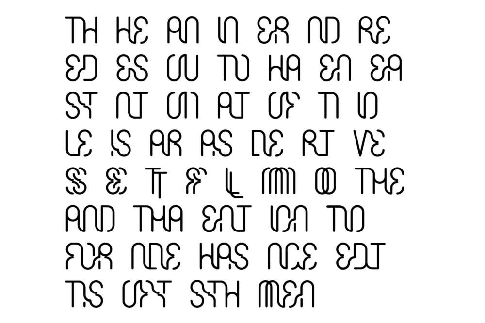
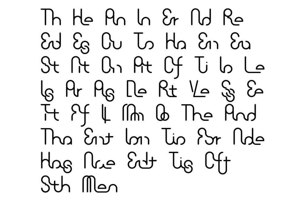
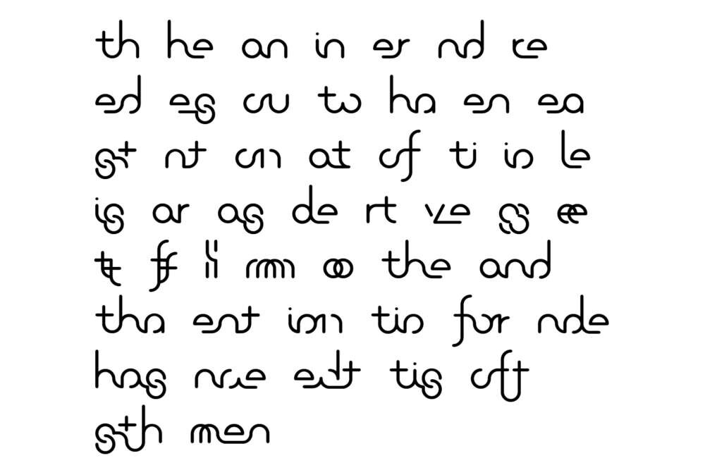
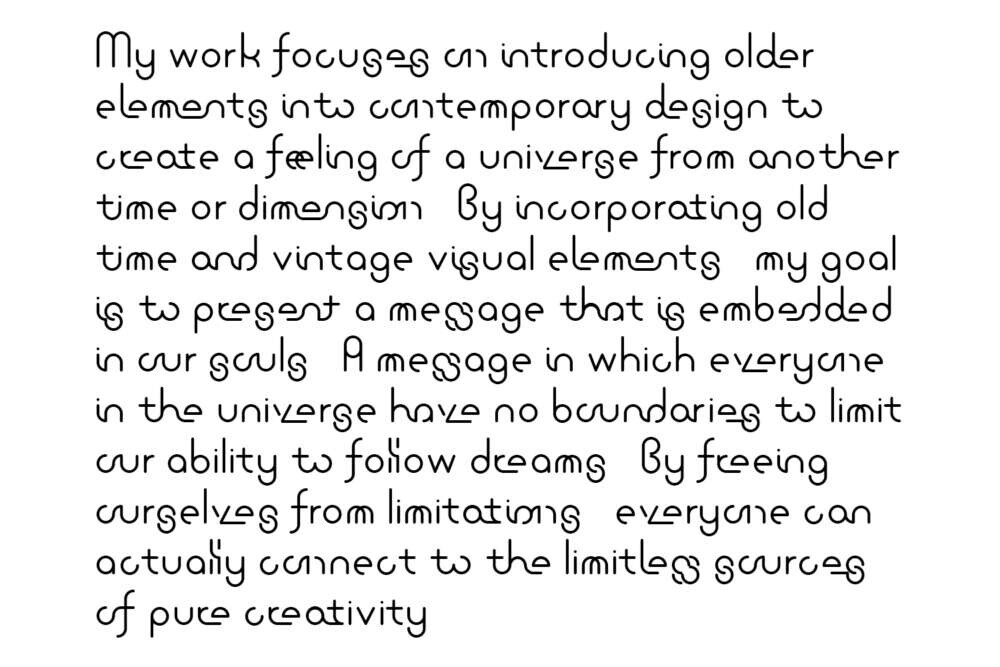
This project is an exploration of the typographic ligature through the monoline approach in typeface design. This typeface uses only full/half/quarter circles and a variation of line length as the building blocks of the typeface. By doing so, the typeface is forced to follow an invisible grid created by the limitations of the basic shapes. This approach led to the production of a basic sans serif typeface for the ligature experimentation project.
Through researching the evolution and application of cursive handwriting and the printing ligature through out the history of typography, this project is experimenting with a contextual ligature. It is a typeface design that falls between the cursive handwriting and the printing ligature with an extended ligature set. By applying straight and curved lines to interconnect the combinations, and eliminating parts of the letters within 2 to 3 letter combinations, the desired effect is achieved. Those 2 to 3 letter combinations are based on the percentage of letters that show up right next to each other within the 1,000 word ratio in the English language. The concept was conceived with the intention of experimenting to utilize the idea of cursive handwriting and ligatures within the basic form of a sans serif font.