Jung Yeon Kim

This city branding project for Seoul, the capital city of South Korea, combines the old and the new by integrating traditional and modern aspects of the city into one cohesive design. According to a survey conducted by Korean researchers, the most unique aspect of Seoul is that there are traditional architectures in the middle of modern skyscrapers all over the city.
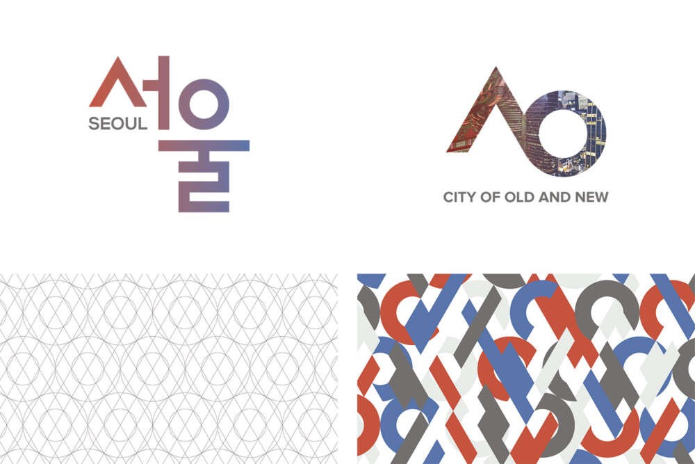
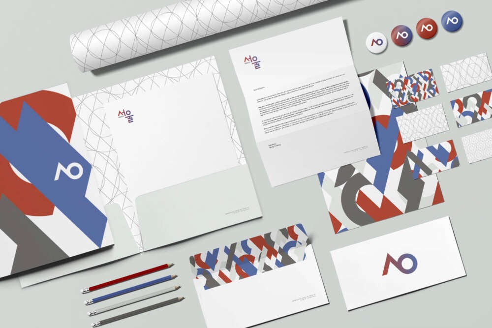
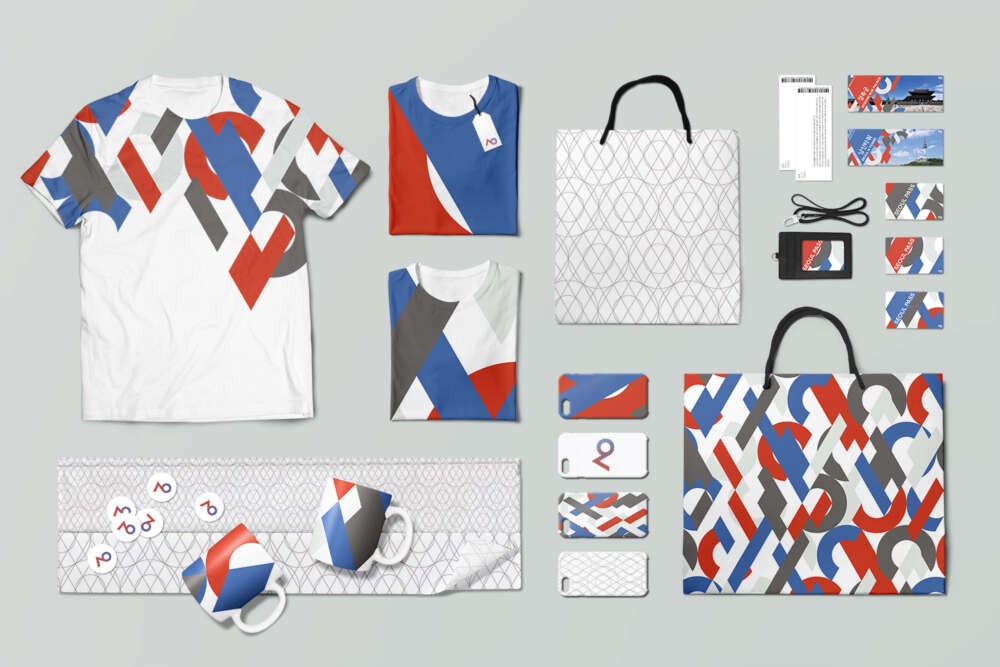
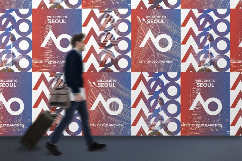
Red and blue drawn from South Korea’s national flag represent each aspect of the city, and the gradient and woven pattern show their coexistence. South Korea’s national flag has a circle of red and blue in the middle, which symbolizes harmony. The logo mark is a combination of the first alphabets of Korean letters “Seo” and “Ul,” and the grid for the patterns were created based on the shape of the mark. The design system can be applied into stationery, gift shop products, tourist pass, tickets and posters.