Yejin Lee

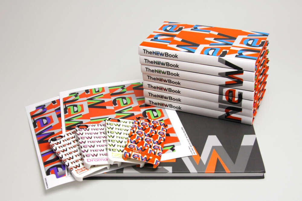
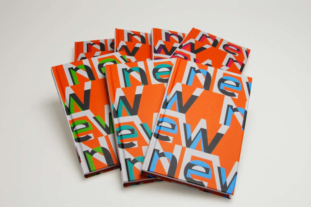
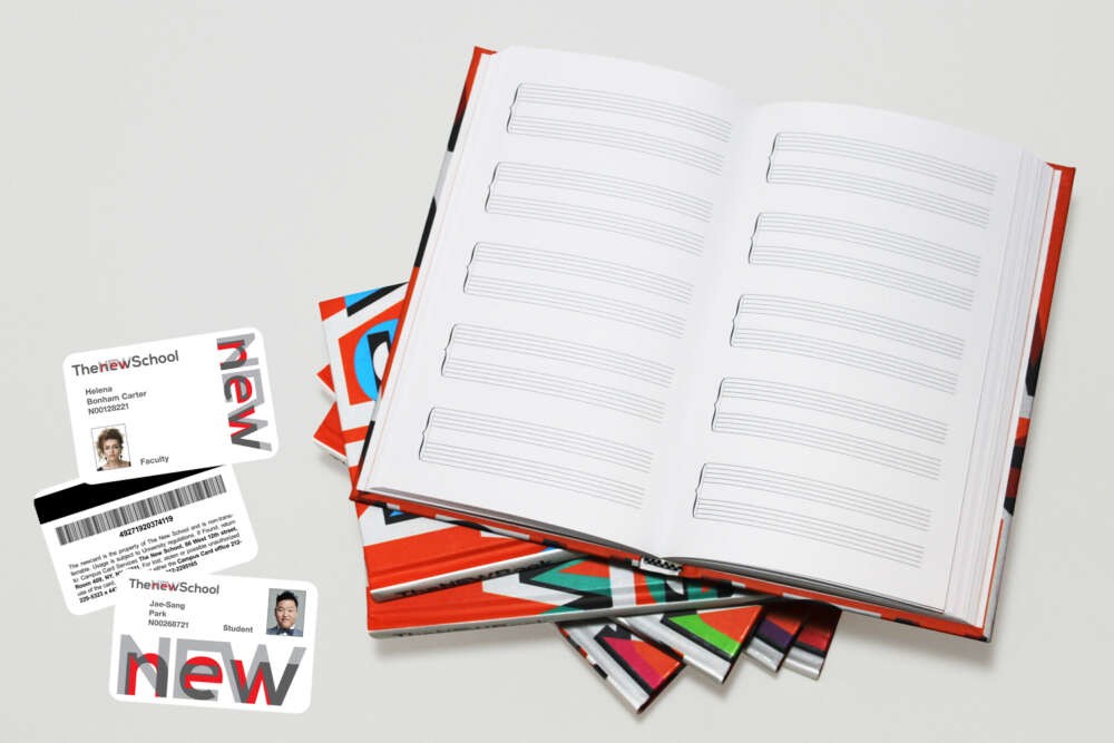
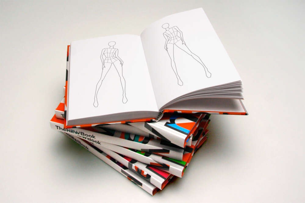
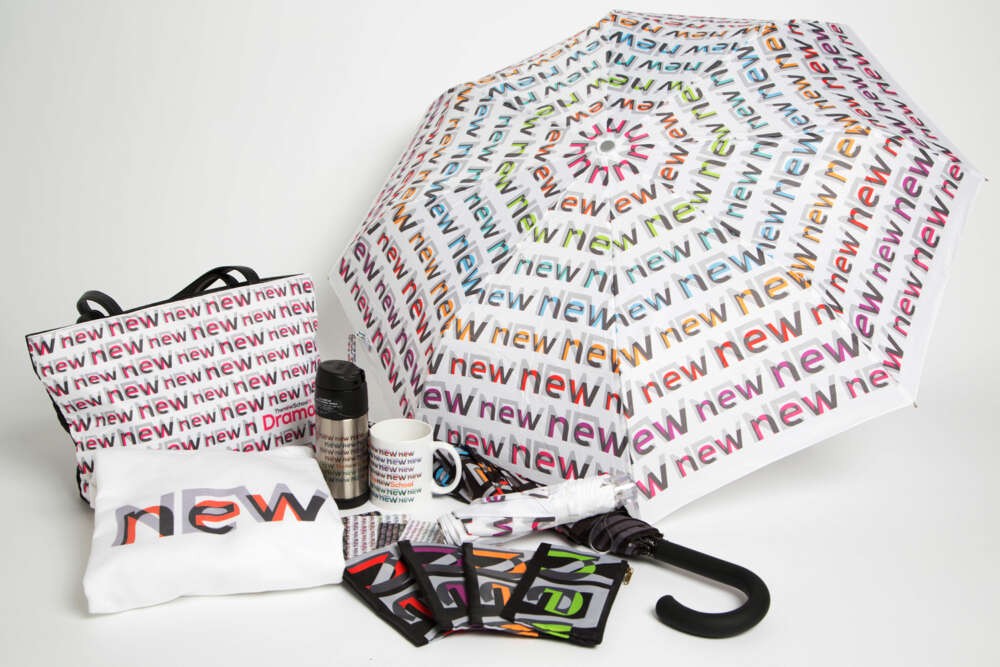
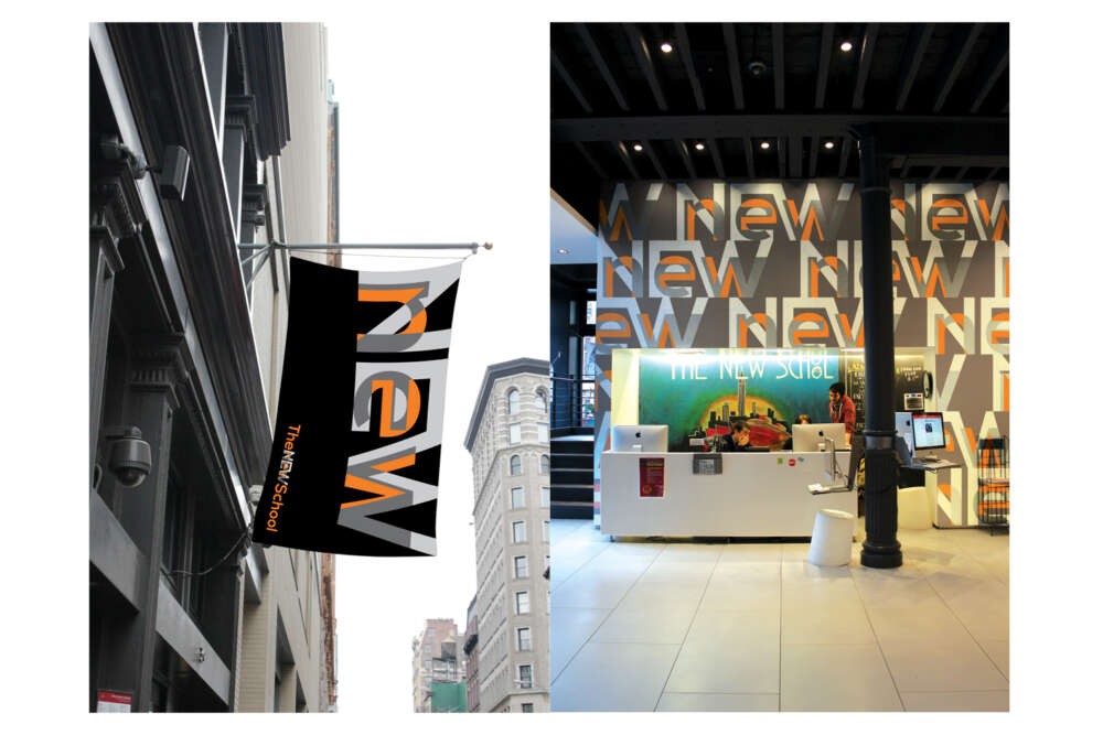
This new branding for The New School seeks to elevate the university’s character, symbolize a constant renewal, and display the unity of its seven divisions while demonstrating each division’s individual character. In the new identity of the university, the word ‘NEW’ is really highlighted by giving it more complexity with deeper definitions. The new form of ‘NEW’ has the layered ‘NEW new’ (an upper and a lower case form). The updated ‘new’ recovers the ‘NEW’ again. The two forms of ‘new’ and ‘NEW’ separate themselves from each other with distinguishing colors. In addition, the overlapped parts of the two forms carry a third color, so that the two forms are divided even more dramatically. The layered ‘NEW new’ indicates that the previous new thing becomes new again, reflecting the history of the university. Including the original orange color of The New School, the updated ‘new’ on ‘NEW’ rotates the eight colors, which are commonly associated with each field of study. It is a simple logic that one design reproduces in different senses. The new identity is successfully applicable to various materials and products. The playful and lively patterns of the identity promote the university’s brand and the distinction of the seven divisions. Seven ‘New Books’ would be given away in each of the seven divisions, each of them are specially designed and edited for students in different fields of study.