Brenna Pladsen
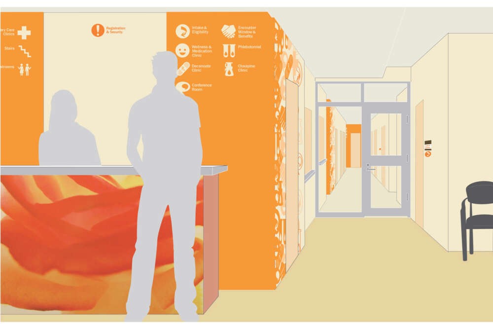
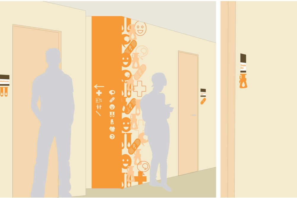
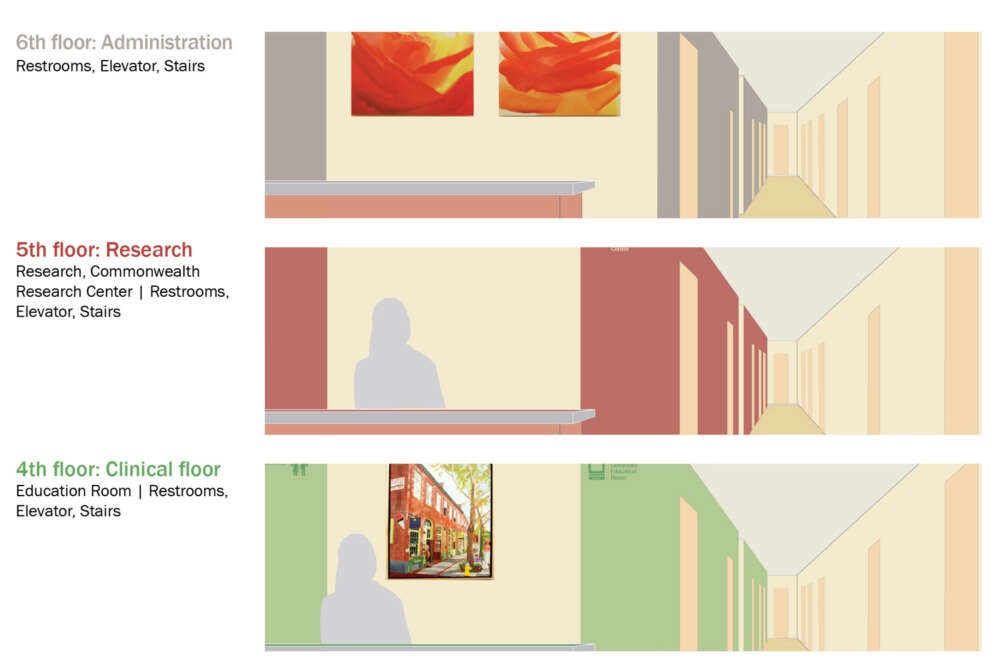
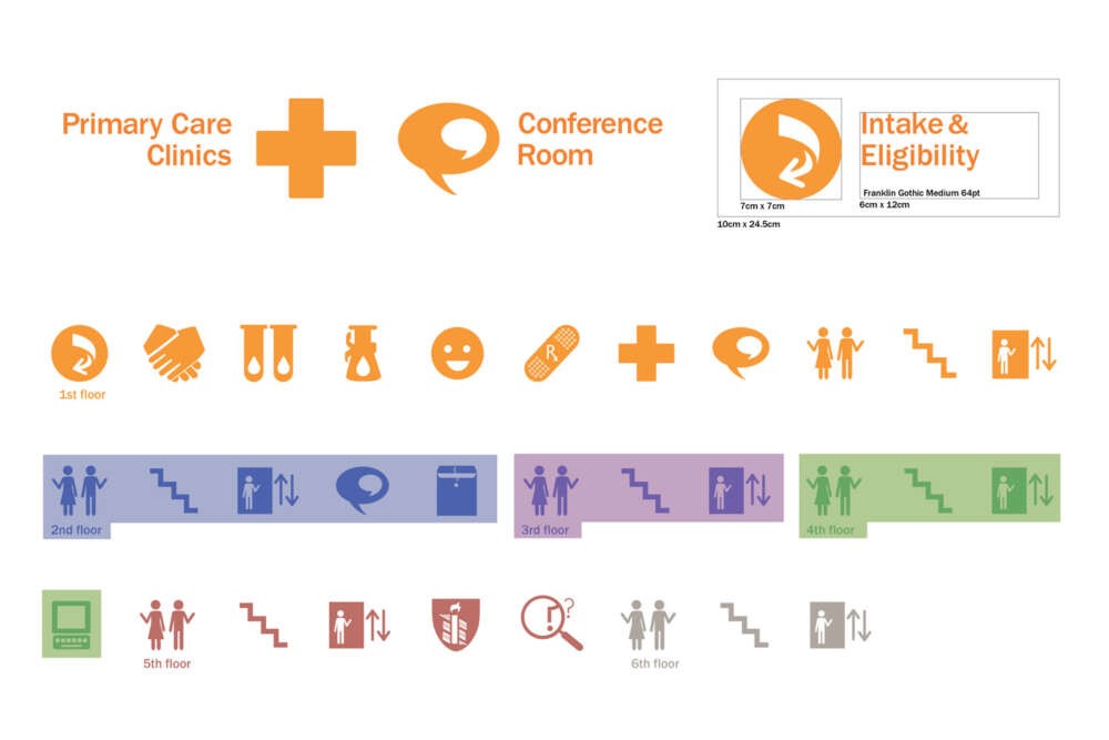
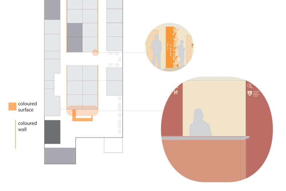
The new facilities for the Massachusetts Mental Health Centre in Boston, a public mental health institution, currently lack signage. I hope to create and implement a system that defines and delineates specialized spaces in an uniformly comprehensive way regardless of language or literacy. My wayfinding system operates via icons and color. Major spaces that are common client destinations are labeled with the linguistic name and an iconic sign. Icons are derived primarily from the activity inside that space, secondarily from a symbolic representation, or thirdly from a pre-existing common semiology. Colour is used to differentiate between floors. Each floor has a unique colour that will be reflected through the wayfinding application. The application of the floor colour is also used as directional guides for the icons, the colour rolls out from the main key and leads to the indicated rooms via a coloured wall. The first floor, which houses the majority of their medical facilities, has an additional pattern that breaks up the monotonous space. The color also incorporates a subtle hierarchy that differentiates the clinical floors both via coloration and through the use of a cooler palette in lighter values to promote calmness and healing. The main user for the wayfinding system are regular clients who are fairly familiar with the space and their destination. They may not, however, have a concrete grasp of the medical or vernacular language to navigate the space. Through my wayfinding system, I aim to create a common group of references to direction-giving as well as personal memory aids while creating a cheerful and friendly environment inside the health center.