Melisa Ozkan
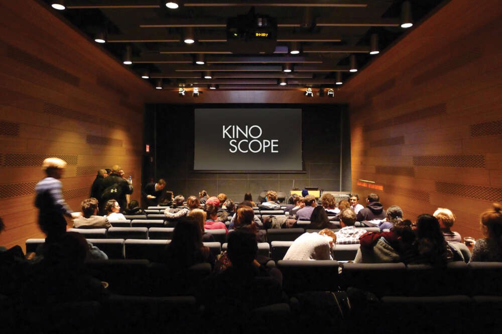
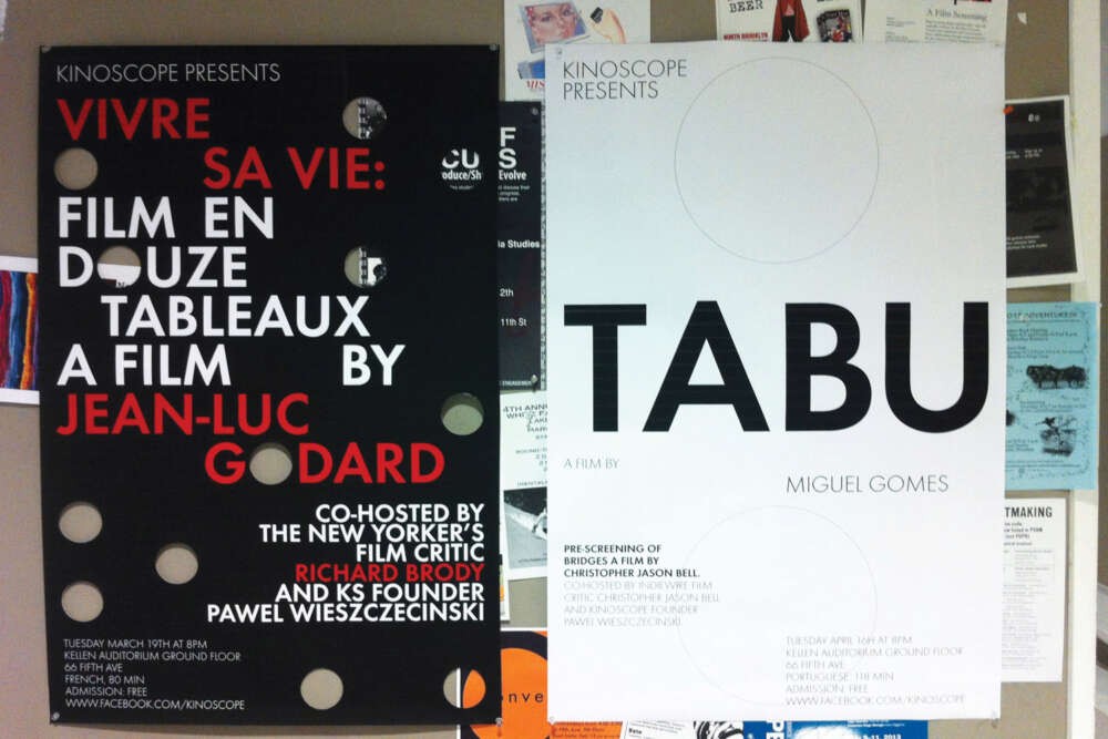
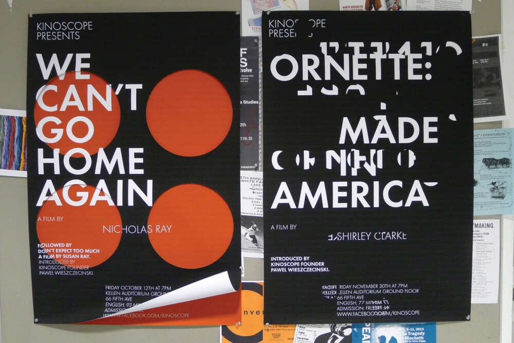
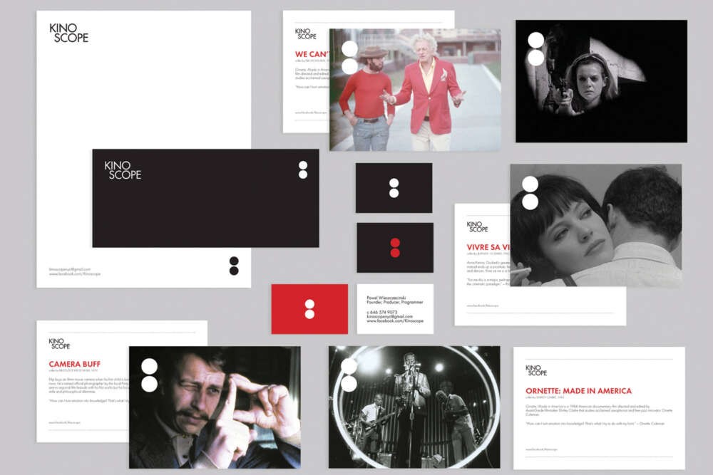
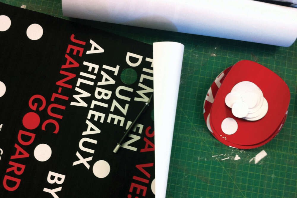

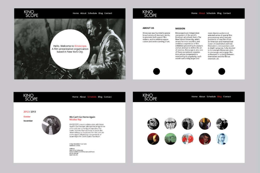
Kinoscope is a collaborative branding project for an independent film organization at The New School with founder Pawel Wieszczecinski. ‘Kino’ is an old European term for cinema, and ‘scope’ means the extent of the subject matter — in this case, cinema. Kinoscope wants to enhance a discussion of film among a larger audience, one not necessarily composed of professionals in the industry or film students. By attending the monthly screenings guests are encouraged to converse with filmmakers and critics, and to think and talk critically about film. Screenings are held multiple times throughout the semester, in Kellen Auditorium at Parsons The New school for Design. The two ‘o’ s in the logo ‘Kinoscope’ each represent an eye; one is the eye of the filmmaker and the other is the eye of the audience. Futura is the principal typeface of the brand, the two geometric ‘o’s are intentionally stacked to draw attention to the logo and the concept. The logomark of the brand will be the ‘o’s from the logo and is consistent throughout the visual identity as a geometric object. The promotional posters made for each screening represent, sometimes abstractly, the content of each film. The circles in the print components will be added to support the idea behind each poster. For example, circles can be cut out or layered making the piece multidimensional, or be shown in a more subtle way