Unseen Hues: Climate, Color & Perception
Isabella Gucci Primo


This digital experience examines how color in advertising is not a direct reflection of the natural environment, but a structured transformation shaped by climate and perception. By analyzing color data from posters across tropical, arid, and polar regions, the project identifies how designers adjust brightness, saturation, and neutrality to construct distinct visual atmospheres that increase desirability.
Rather than reproducing environmental color, advertising amplifies, suppresses, or reorganizes it to align with cultural expectations and perceptual habits. These shifts reveal that color operates as a negotiation between environmental conditions, design intent, and viewer interpretation, producing region-specific palette structures rather than universal solutions.
The project combines computational color extraction with visual analysis to map these differences across climates. Poster imagery is paired with environmental references to highlight where translation occurs, making visible the gap between what exists in nature, what is designed, and how it is perceived.
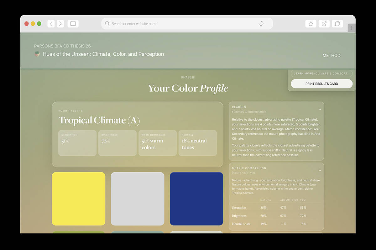
An interactive component extends this research by allowing users to generate a personal color profile through image selection. Their preferences are positioned within the dataset, enabling comparison between individual perception, commercial palettes, and environmental color systems. This profile is then applied as a live camera filter, recalibrating real-time color and making perception visible.
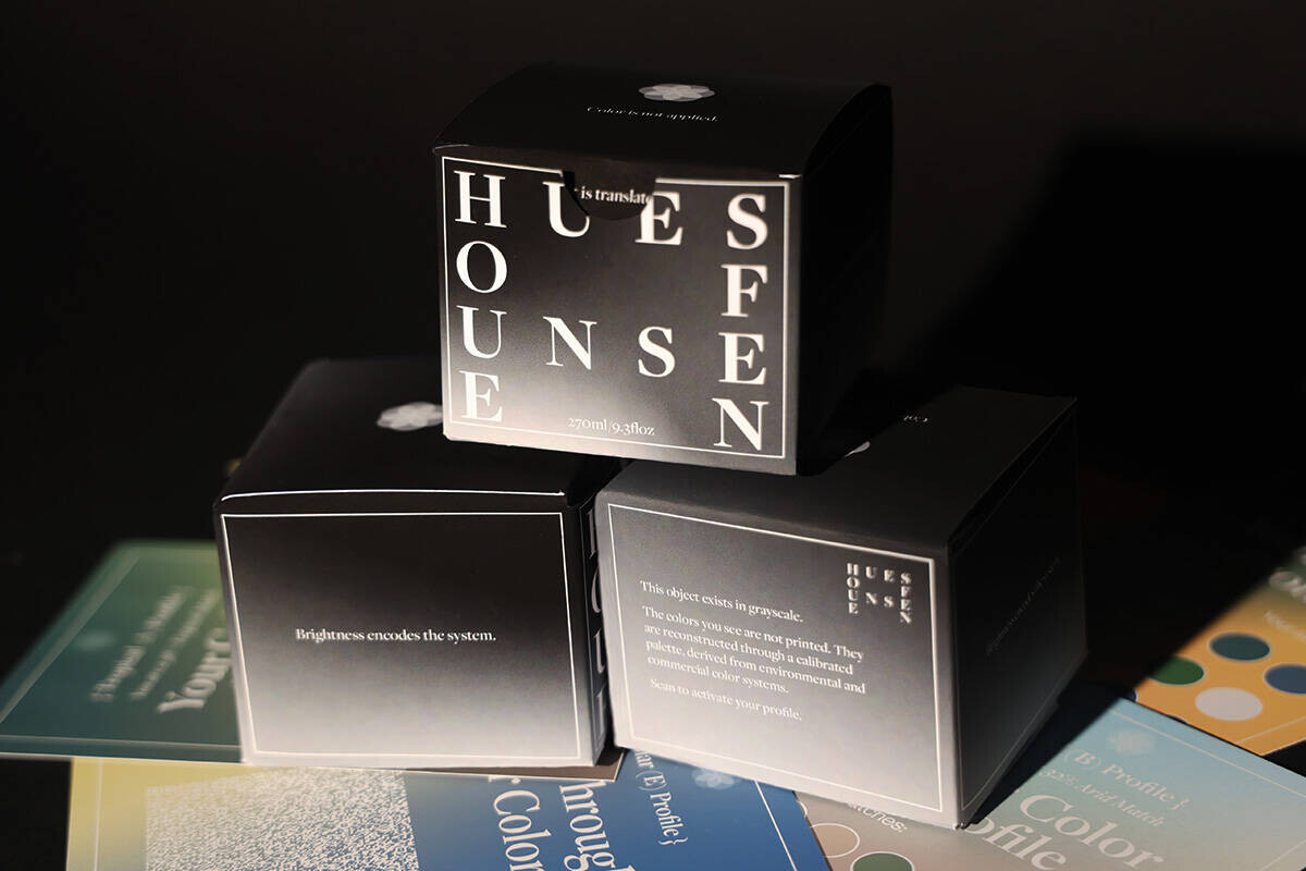
These ideas are further translated into physical form through packaging that appears muted to the naked eye but reveals layered color and information when viewed through the filter, linking data, perception, and material output.