Perception to Projection: A Visual Translation of Sensory Experiences
Aarya Srikumar
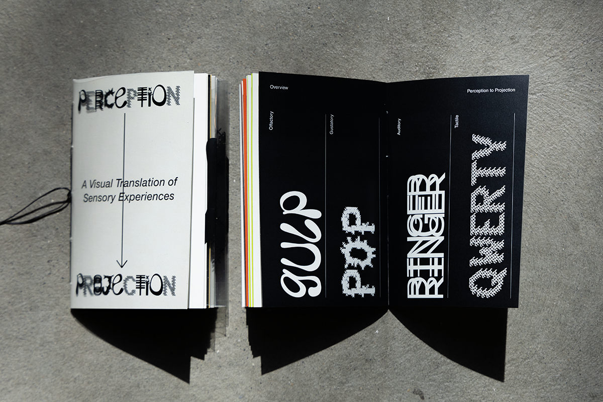
In a world that is often perceived through sight alone, Perception to Projection seeks to translate intangible and visual forms. Communication extends far beyond what meets the eye, and this project delves into the realm of multi-sensory expression using typography as the primary medium.
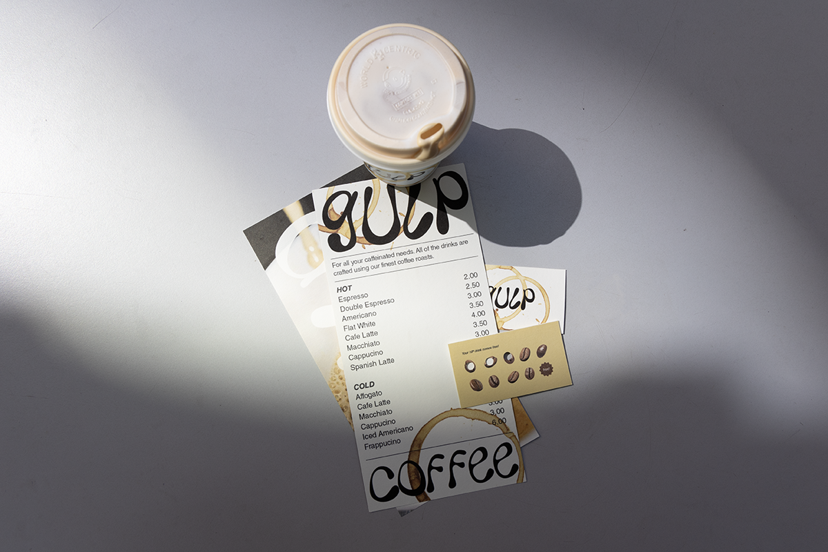
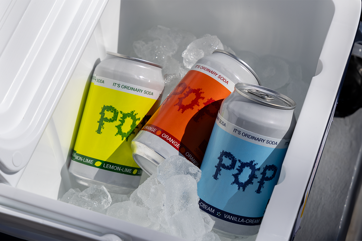
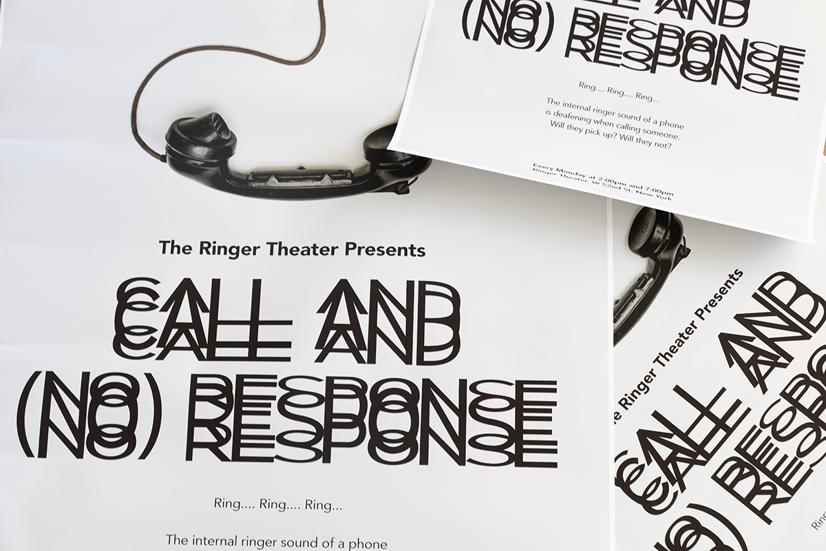
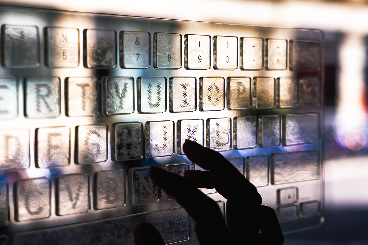
Using familiar experiences, the project takes a deep dive into the nuances of touch, taste, sound, and smell. Using experimental and exploratory making processes that involve playful interaction with others helps better understand their responses to various sensory stimuli. The end product is a collection of four sets of sense-inspired letterforms—Gulp, Pop, Ringer, and Qwerty—which are designed based on those responses. In this case, typography becomes more than just mere letterforms, it is re-contextualized to embody the aroma of coffee, the effervescence of soda, the rhythm and repetition of an internal call ringer, and the texture of the keyboard, and applying them to real-life settings. These sets of alphabets were then applied to a uniquely designed product, each a personification of their respective stimuli.
Perception to Projection celebrates human perception and expression. By combining typography with multi-sensory inputs, we are able to interact with the world in new ways that go beyond the limitations of sight and encompass the entire range of sensory experiences. True communication is more than just conveying information; it is also about making connections that resonate across all of the senses.