Vanshika Swaika
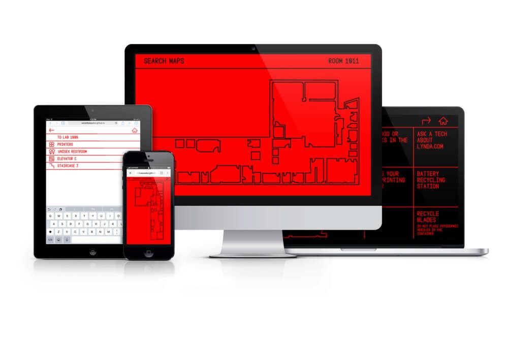
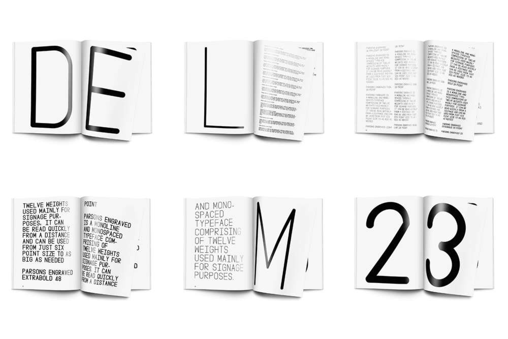
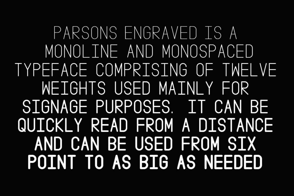
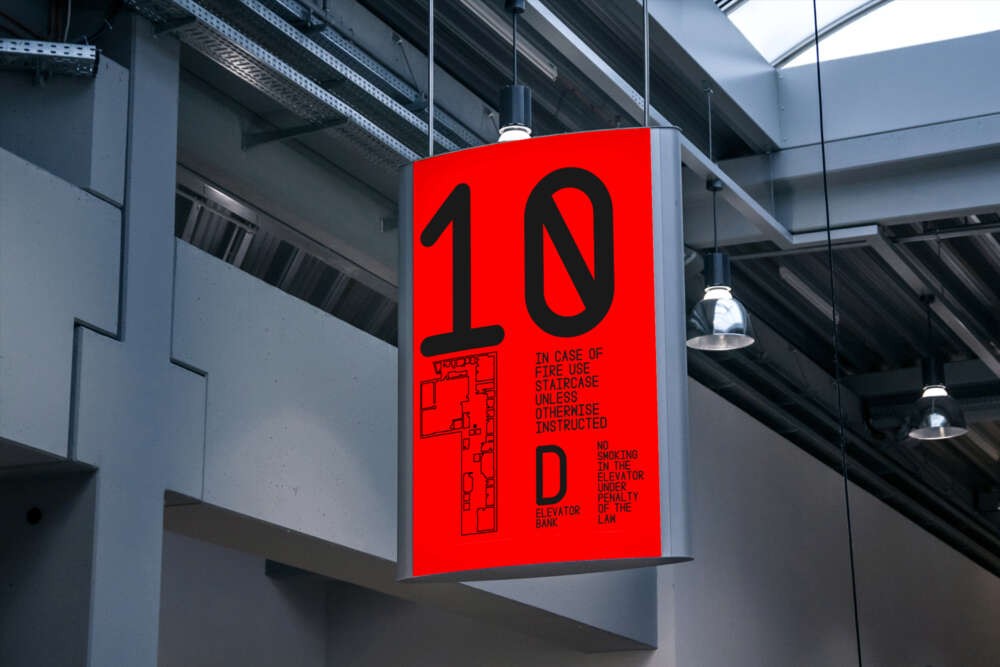
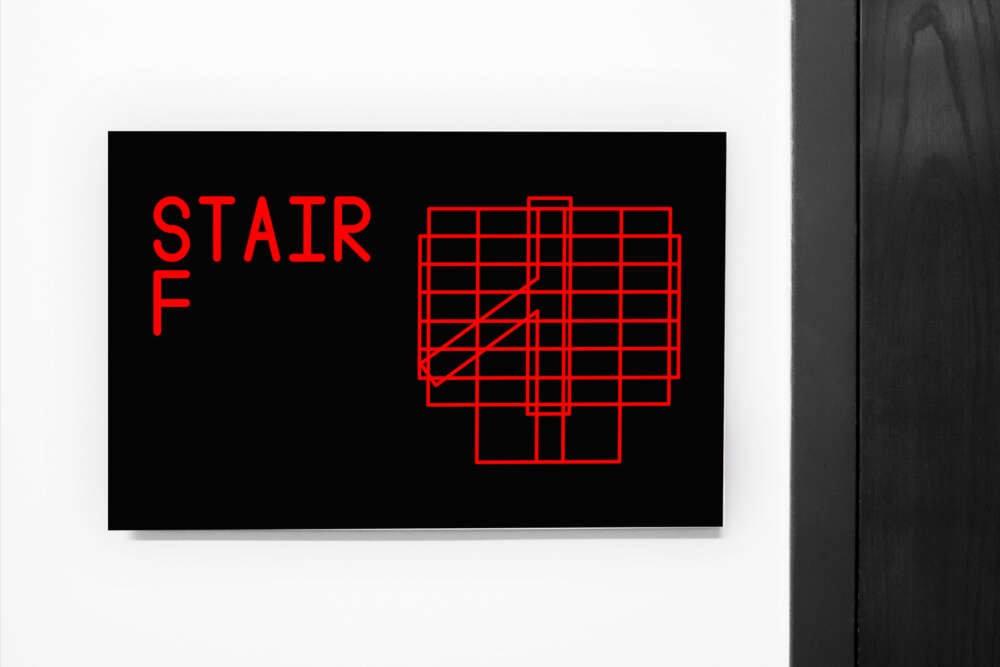
Parsons Engraved explores wayfinding and signage design using Parsons School of Design as a case study. It is comprised of a custom typeface, a physical printed way finding system, and a web mapping service that gives directions inside campus. This project analyzes how people interact with spaces and is aimed to solve spatial, signage, and wayfinding problems. Rigid parameters were used to create a visual system that was easy to understand. The process began with research on wayfinding and signage in different environments. From there an identity for Parsons was created with the typeface Parsons Engraved. This typeface is inspired by monoline typefaces whose primary usage was in engraved signs. Parsons Engraved is based on a 2:1 grid made of geometric shapes. It is comprised of twelve weights, ranging from ultralight to black. Each weight is assigned to a floor in order to create a visual hierarchy of levels. Red and black were used to emphasize the information hierarchy on the signs. The print signs were based on the Din system of paper. This helped to highlight the importance of different signs through size and information hierarchy, the largest sign being A0 and the smallest one being A5. The importance of mobility for these signs was inevitable. Hence, Parsons Engraved is also an interactive website that allows users to search for a location, offer information unique to that space, and give directions on how to get there.