Julia Vidal
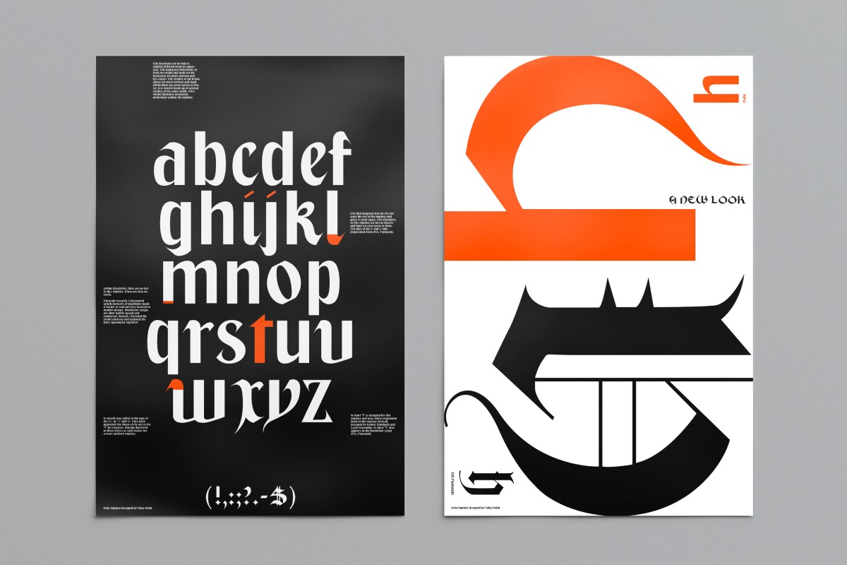
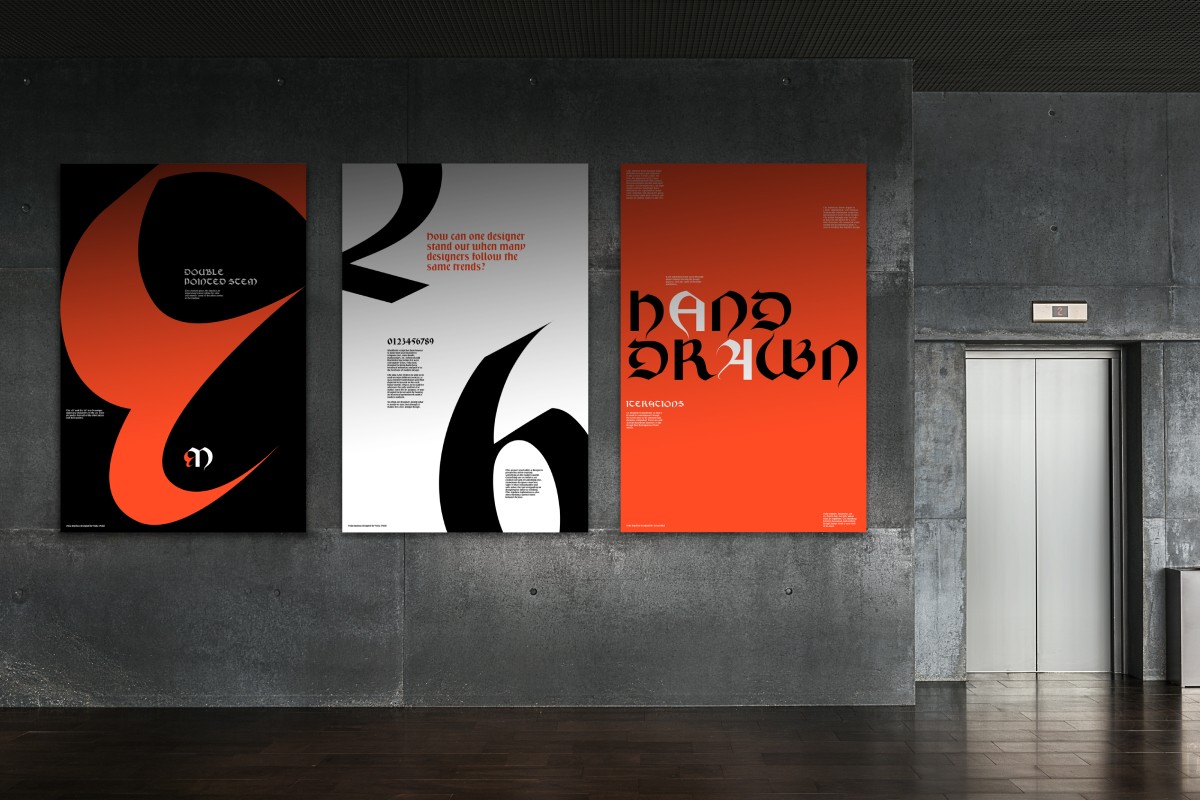
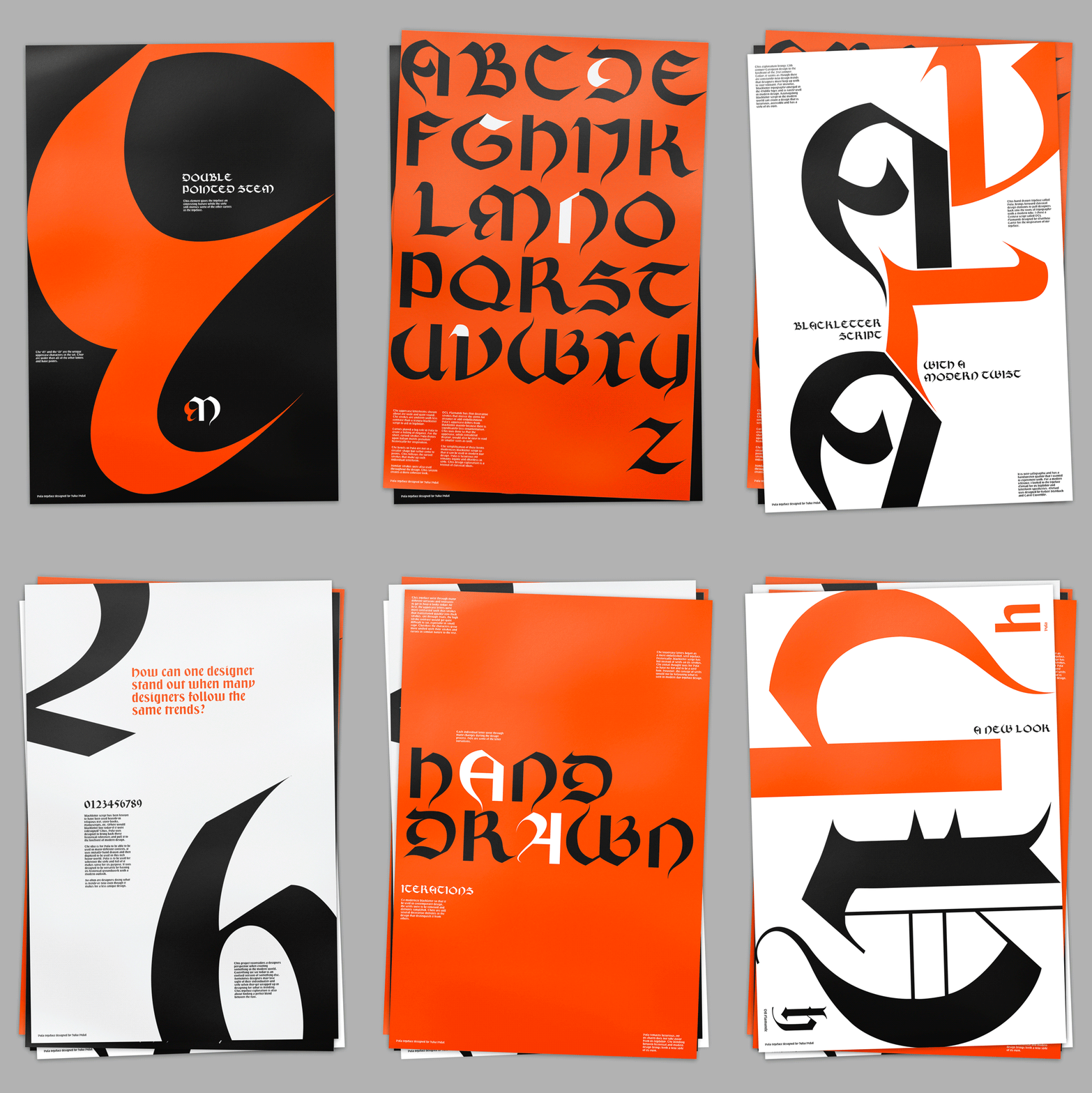
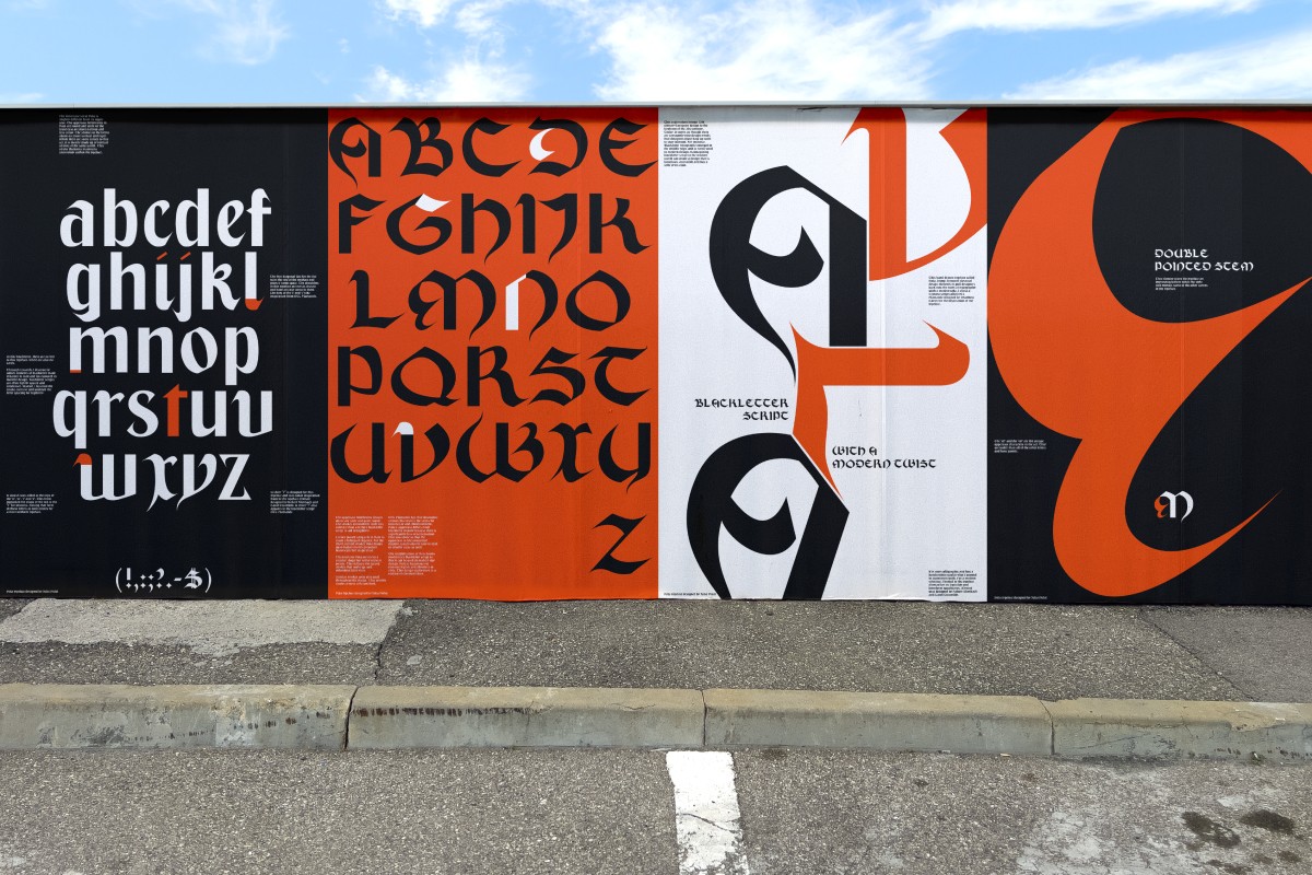
This exploration brings 12th century European design to the forefront of the 21st century. Today, it seems as though there are constantly new design trends that designers must keep up with to stay relevant. For instance, Blackletter typography emerged in the Middle Ages and is rarely used in modern designs. Reimagining blackletter script in the modern world can create a design that is luxurious and accessible.
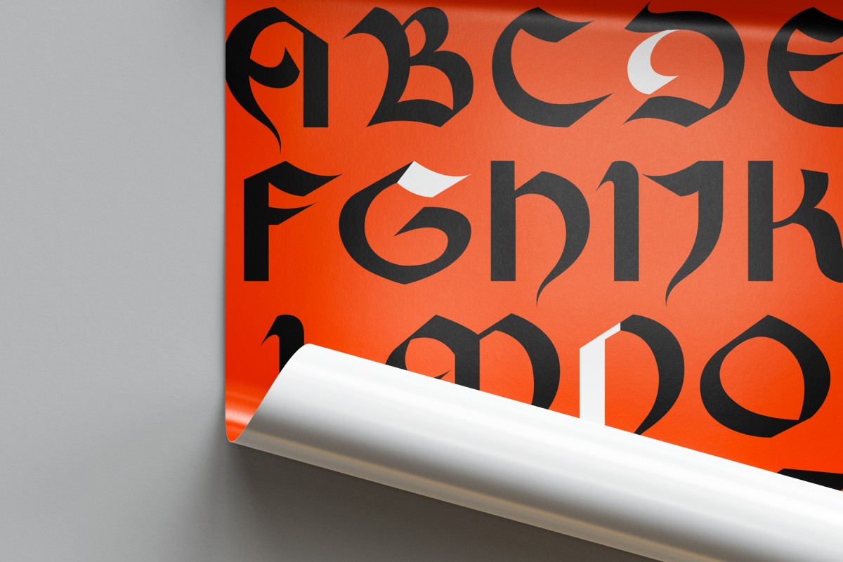
This hand drawn typeface called Vala, brings forward classical design elements to pull designers back into the roots of typography with a modern take. I chose a Textura script called DTL Flamande for the inspiration of my typeface. It is very calligraphic and has a handwritten quality that I wanted to experiment with in my type exploration. For a modern reference, I looked towards the typeface Myriad for its legibility and letterform specificities.
Through research, I discovered which elements of blackletter made it harder to read and less favored in modern design. Blackletter scripts are often tightly spaced and condensed. Instead, I lessened the stroke contrast and widened the letter spacing for legibility. Curves played a big role in my typeface and created that feeling of elegance. For my short, curved strokes I drew inspiration from historically relevant Italian motifs. Vala is luxurious yet remains legible and effortless in style.
Lastly, I designed a type specimen in the form of a series of typographic posters to showcase the work along with telling its story. I call this design exploration a revival of classical ideas.