Julia Isman


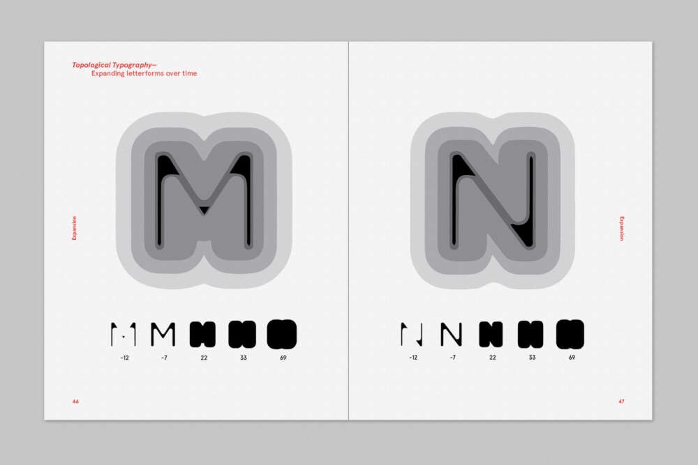
This project explores the concept of topological letterforms, as they transform in space over time. In the realm of type, topology is studied through the expansion of edges and vertexes. In other words, how the degree to which one rounds a letterform creates different results and legibility, as parts of the form come together and overlap.
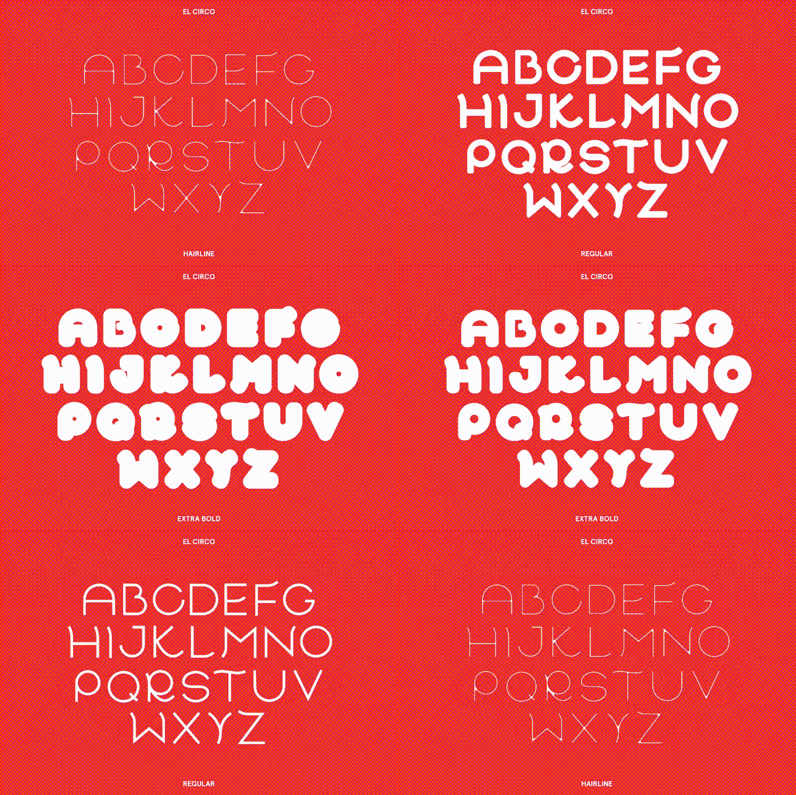
Research involved a multi-step process: testing how extreme or minimal deformations affect a letterform’s legibility, producing an infinite range of weights for a resultant typeface, and finally using a static version of the typeface applied to a second topological form, a simple rectangular prism. Overall, the work expanded on how the application of a kinetic typeface changes the medium to which it is applied.
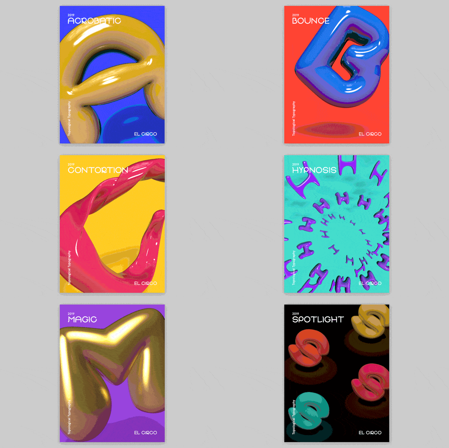
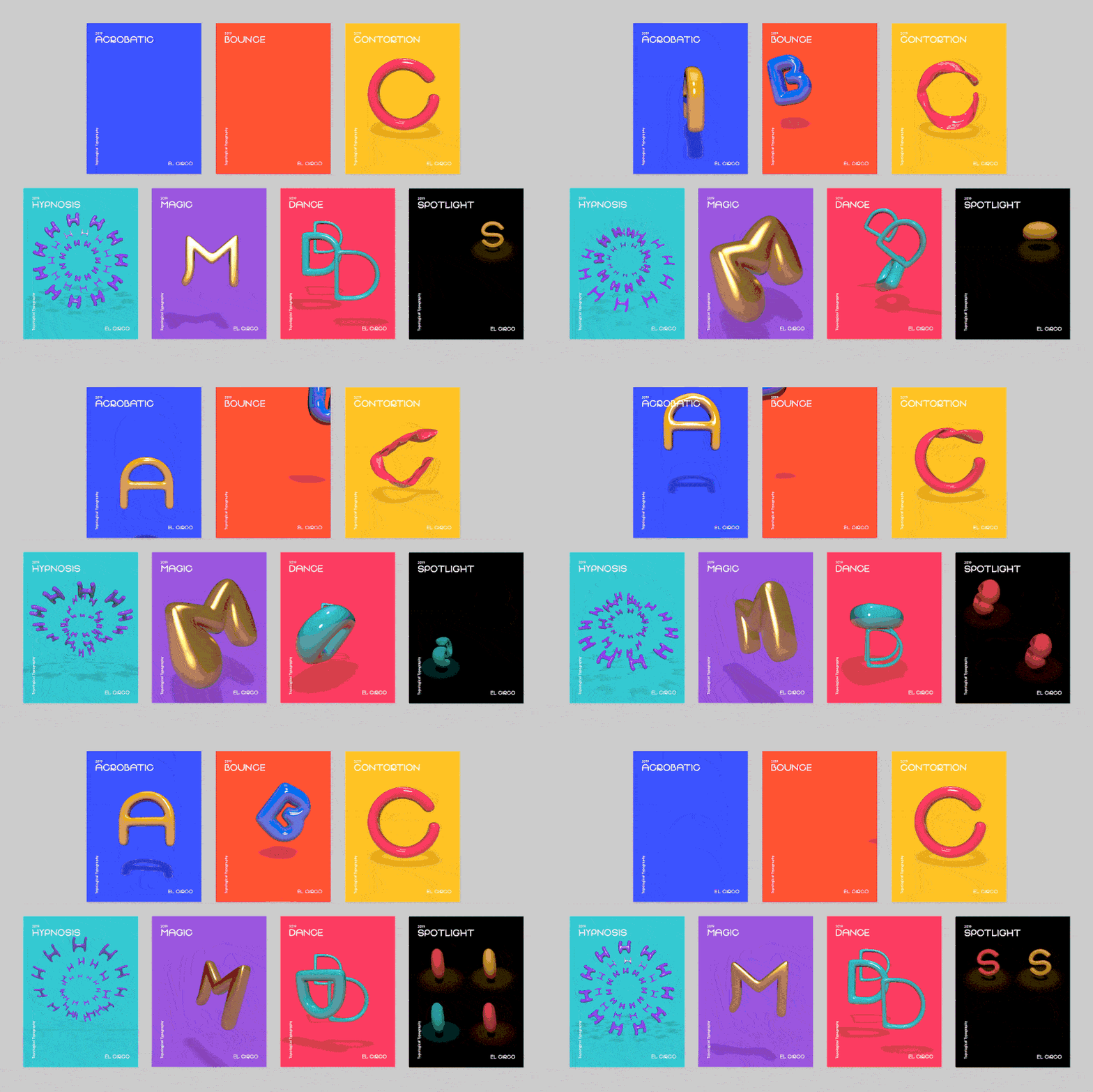
Putting together the different components of research led to the creation of a topological typeface called El Circo. Its design expresses fluidity and movement, as its curved terminals and rounded geometry are analog to the agile acrobats of a contemporary circus. Its weights are solely based on the expansion of edges and vertexes over time, and it shows how it does so in both 2D and 3D realms. The final type specimen is presented as a set of motion posters. The 3D letterforms push the limits of dimension by essentially having an infinite range of weights, as the soft dynamics of the form are affected by action and reaction. Finally, all of this is tied together under the umbrella of a circus because it is, after all, where it all began.