Adam Johansen


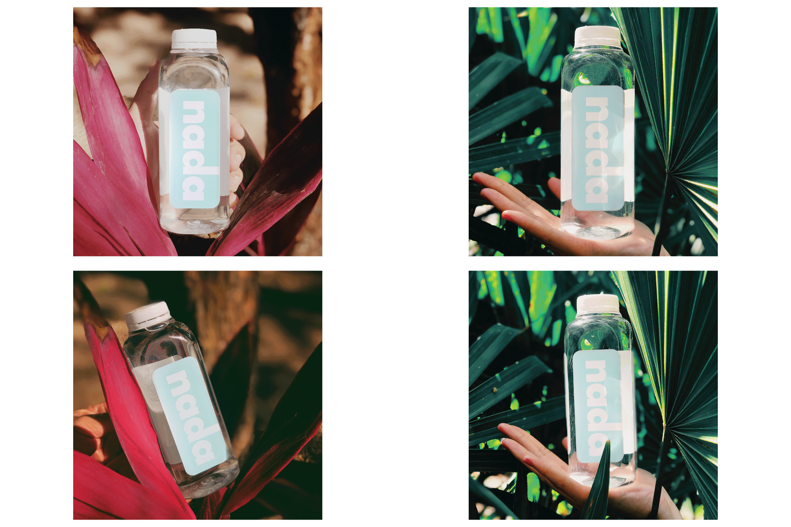
In this time of social media domination, to be successful in any industry depends on the thorough use of these platforms. Nada is a water beverage that will never go to market, yet it is designed and conveyed as if it will. It is a faux brand experiment with the intent to amass a loyal social media following in two months, through a cohesive and consistent social media design and presence. It is an experiment demonstrating the impact of branding and marketing produced with minimal resources, using Instagram as the primary platform.
The brand identity, product design, and marketing collateral of Nada are all considered for maximum exposure on this platform, aimed at young, health-conscious, brand-loyal, and aesthetically attuned individuals. By employing beauty brand vernacular, trending hashtags, a bright “insta-worthy” blue and GT Walsheim, a computer produced typeface with smooth curves, to portray a sense of modernism and ease of readability as the brand’s typeface of choice, paired with visuals of minimalist workspaces and natural environments. The identity evokes a youthful and vibrant, yet sophisticated lifestyle that people desire.
Nada exposes the deceptive tactics which increasingly drive consumer society in an ever-expanding technological climate. This project intends to raise awareness of our consumerist society and how it permeates the world of advertising and the products we purchase daily, encouraging us to make more informed consumer decisions.