Cultural attachment and adaptation
Maya Eapen

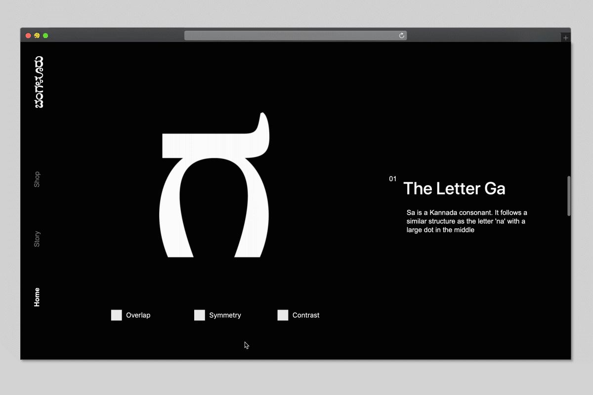


The influx of western influences and globalization in India have increased the popularity of English as a spoken language among the urban, Indian youth. English connotes status. As a result, many young Indian, including myself, have grown up without learning or practicing our mother tongues. My typeface, Bangalore Display, questions whether typography can change the attitude of the Indian youth and inspire them to learn and speak their regional languages.
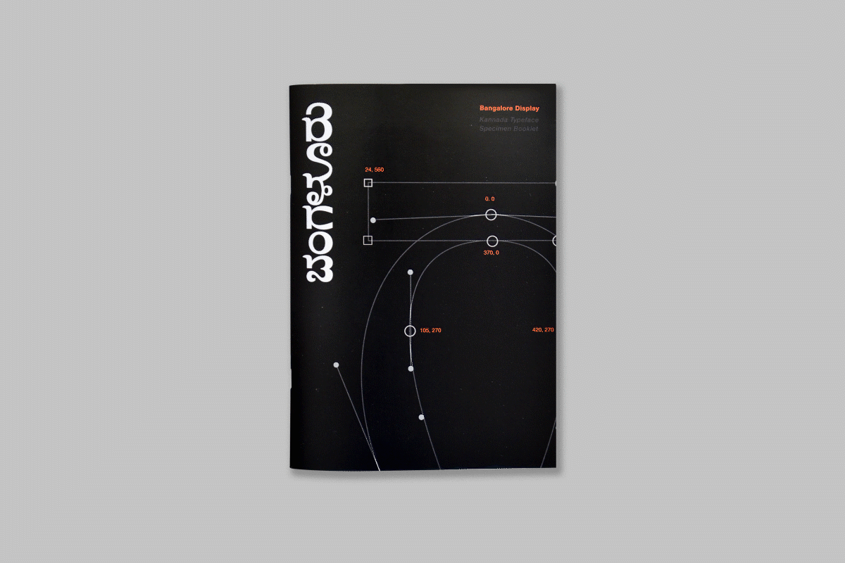
Bangalore Display is a playful, and bold Kannada (a South Indian Language) typeface inspired by the hand lettered street signs scattered across my childhood home of Bangalore, India. The friendly and bubbly appearance of the typeface intends to appeal to a younger demographic and make the language accessible to them. It is displayed on an interactive microsite that breaks down the nuances and stylistic choices behind the typeface to help users appreciate the details that went into the design. The typeface is accompanied by a type design compendium that documents my process of learning the language Kannada while designing the typeface. It includes personal reflections about experimenting with different materials followed by deeper conversations with type experts. By making the language accessible to young Indians, I hope the project inspires them to appreciate the beauty of Indian languages and encourages them to engage with their mother tongues.