Emma Lepore
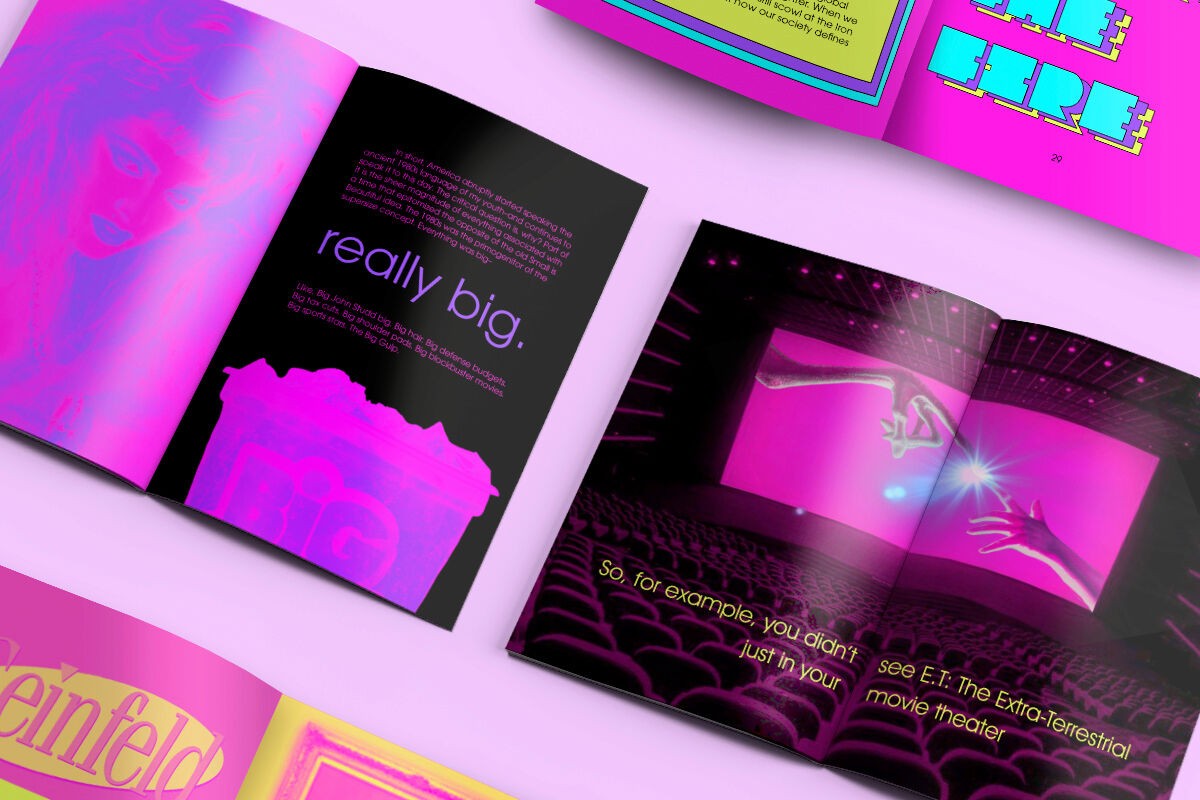
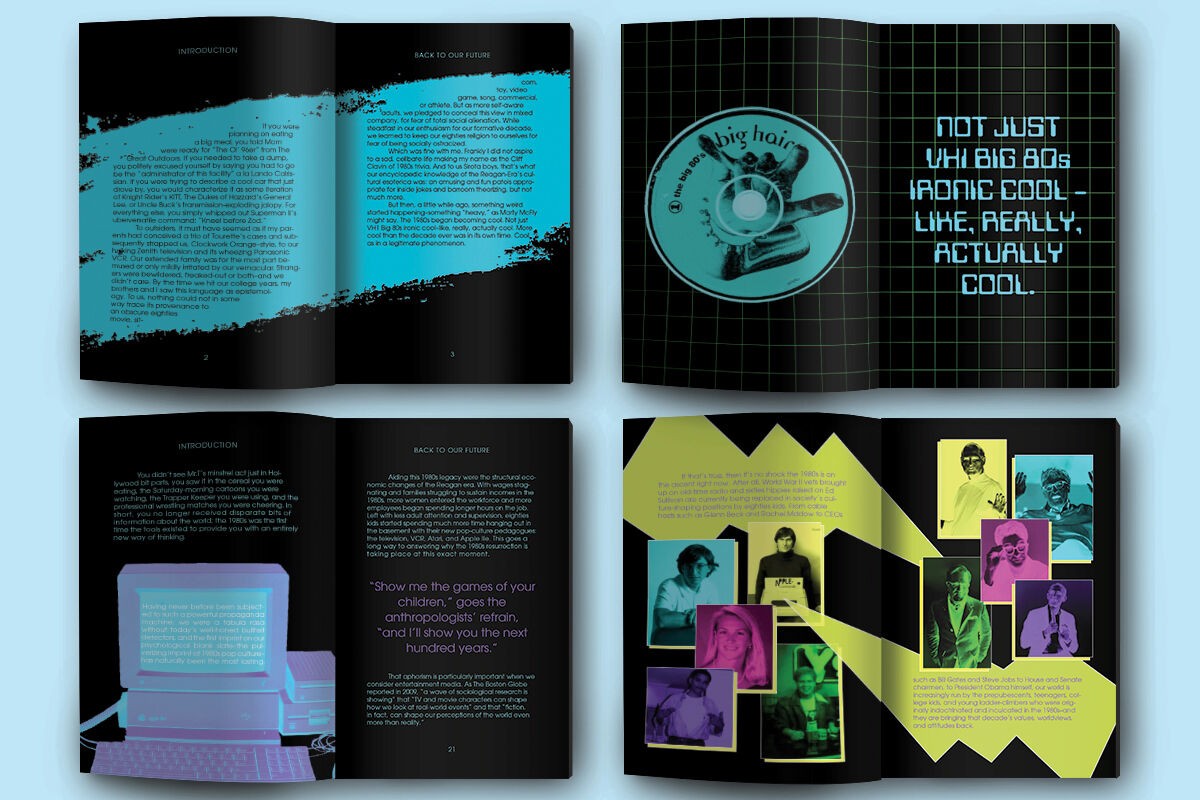
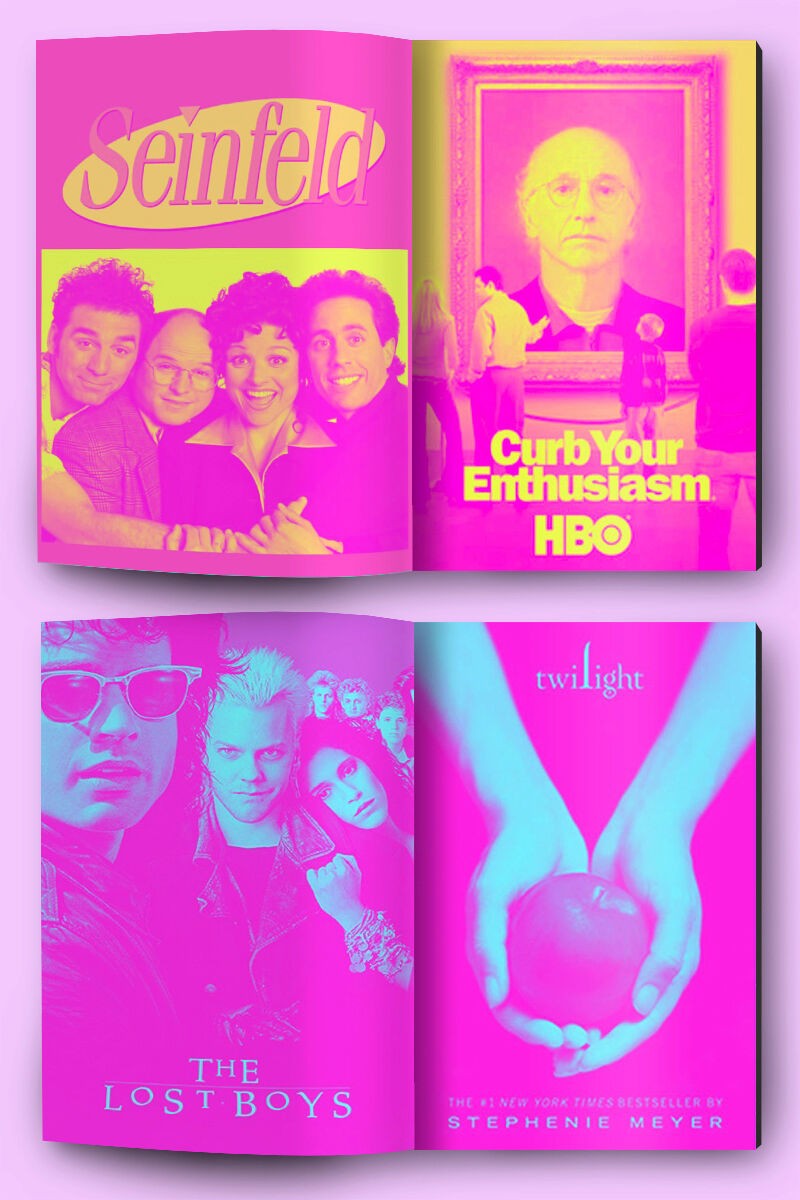
Reflecting on my personal brand as a designer, I find that I gravitate towards colorful, noisy, spunky, and formative compositions. At one point during my time at Parsons, I wasn’t fearless about my love for these styles, I thought that others would perceive it as silly or “bad design.” However, a confidence had grown in me over the years as I met professors and peers who celebrated my design style and saw the joy and friendliness that such compositions evoked. I best express myself through color, pop, and maximalism, and I can now embrace the noise and quirk that defines me, in and out of Adobe Suite.
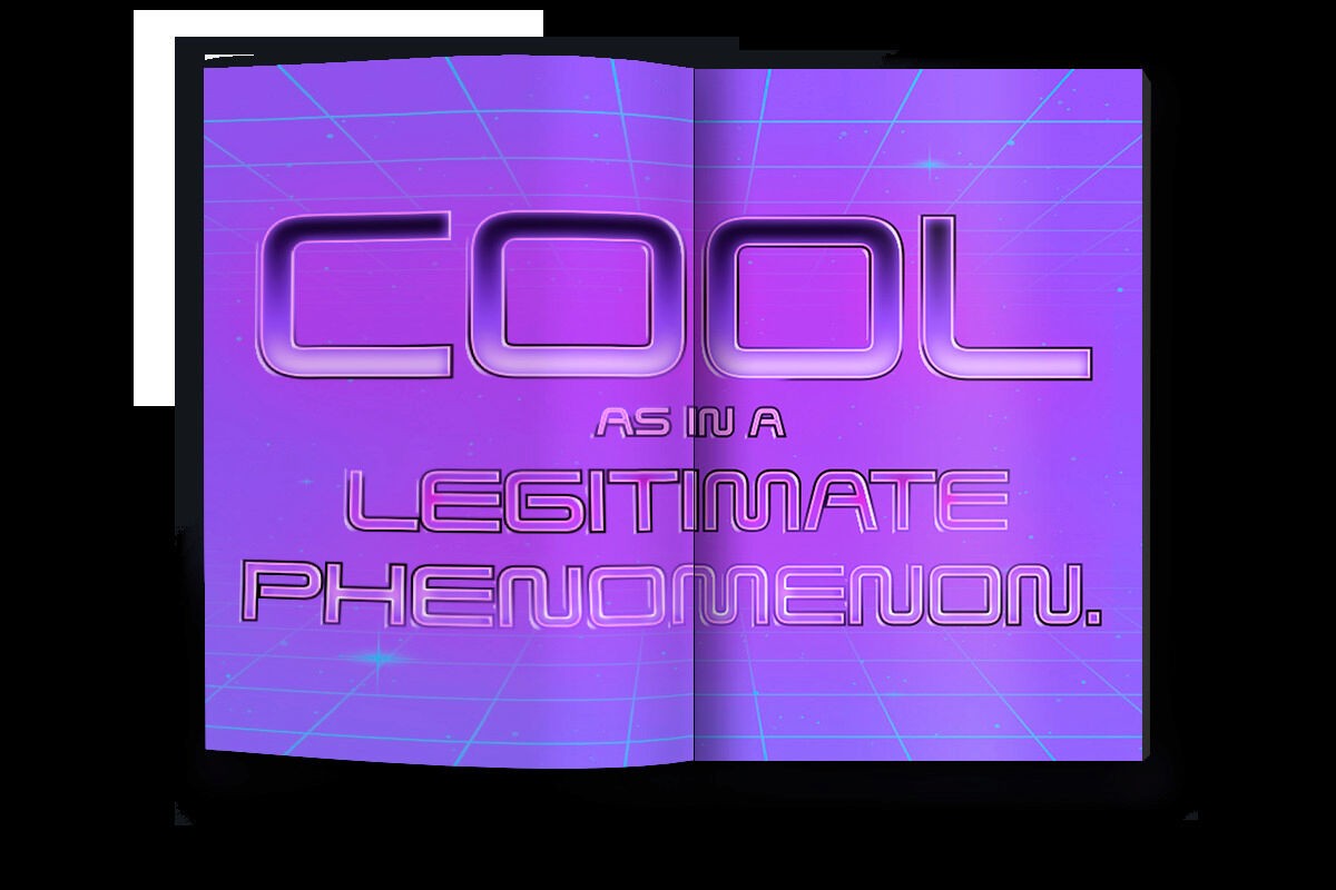
For these aesthetics and inspirations, I can give many thanks to the visual pop culture of the 1980s, an era that is glorified and a lot of graphic design harps on. We are truly living in the shadows of the 80s, as everything since that decade informs what we do today. This is supported by David Sirota’s text, Back to Our Future, which discusses this exact idea, that everything we do in our current pop culture, politics, and entertainment is influenced by this time period. For my thesis, Back to Our Future Remix, I am directly using Sirota’s text as a vehicle to explore and celebrate the realm of formative design, repurpose 80s’ retro inspired imagery, and challenge my wit and personality as a designer. I aspired to let the pages of this book be unapologetically 80s and effortlessly me.